

McDonald’s Drive Thru Design
An easier way to get your fry fix
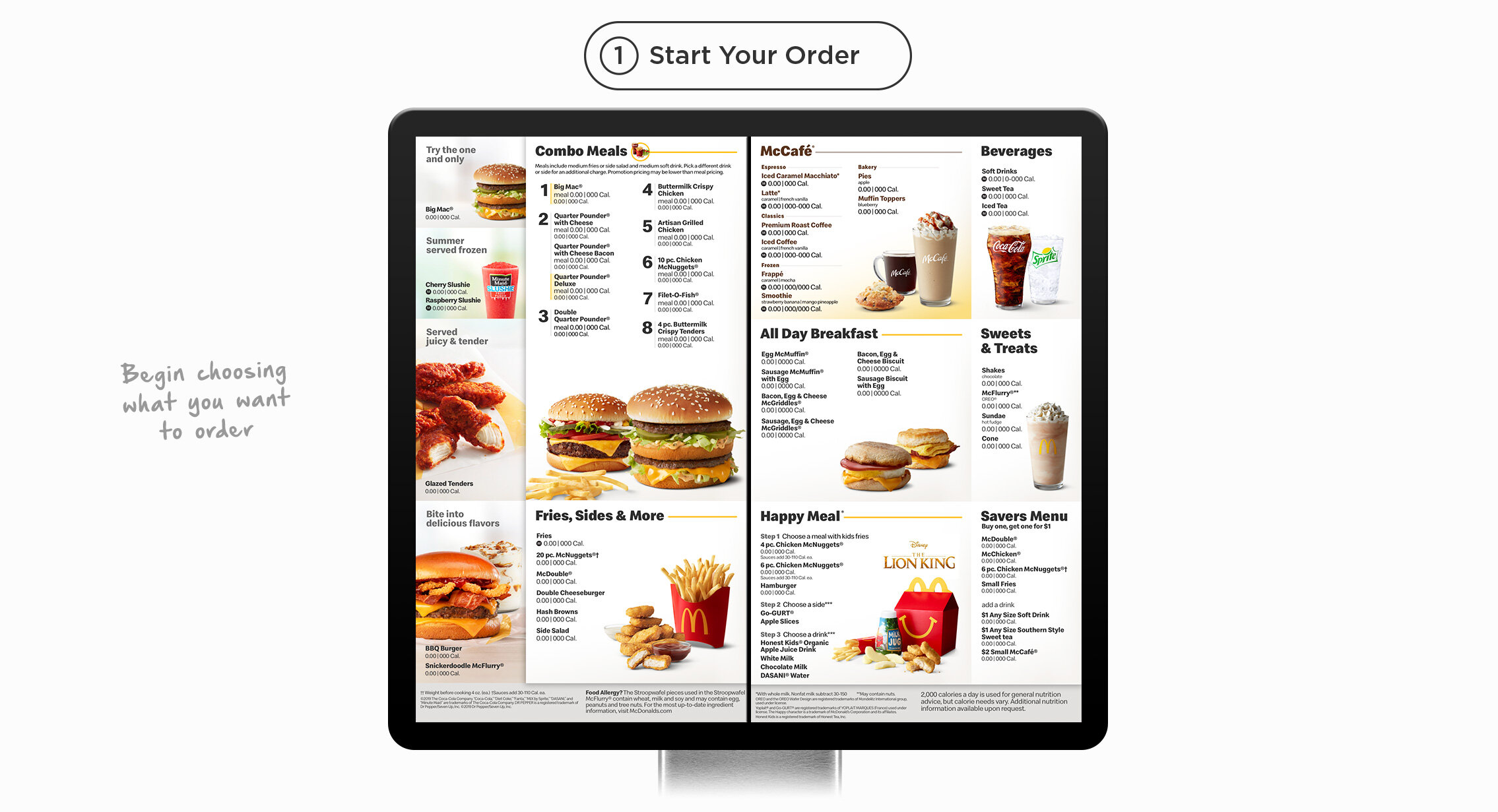
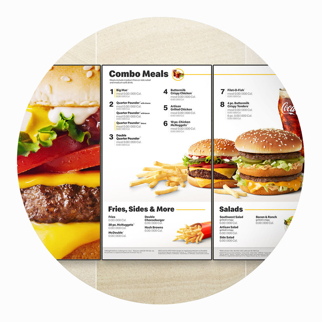
Take the word’s most complicated restaurant menu. Now try squishing it into the two panels that make up the McDonald’s drive thru. The easy way out is to reduce the size of all images and make it almost all type. I challenged that idea by making a menu that’s easy to navigate while still looking clean and simple too.
The Drive Thru has come a long way.
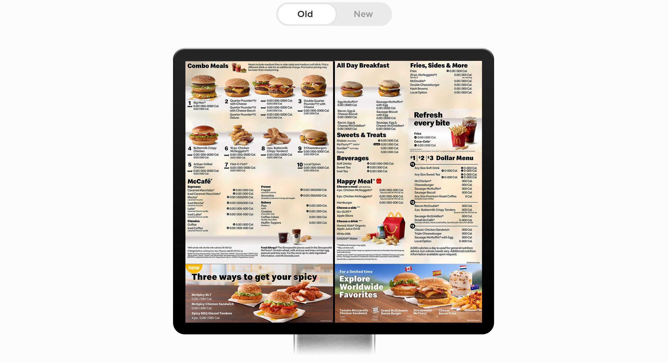
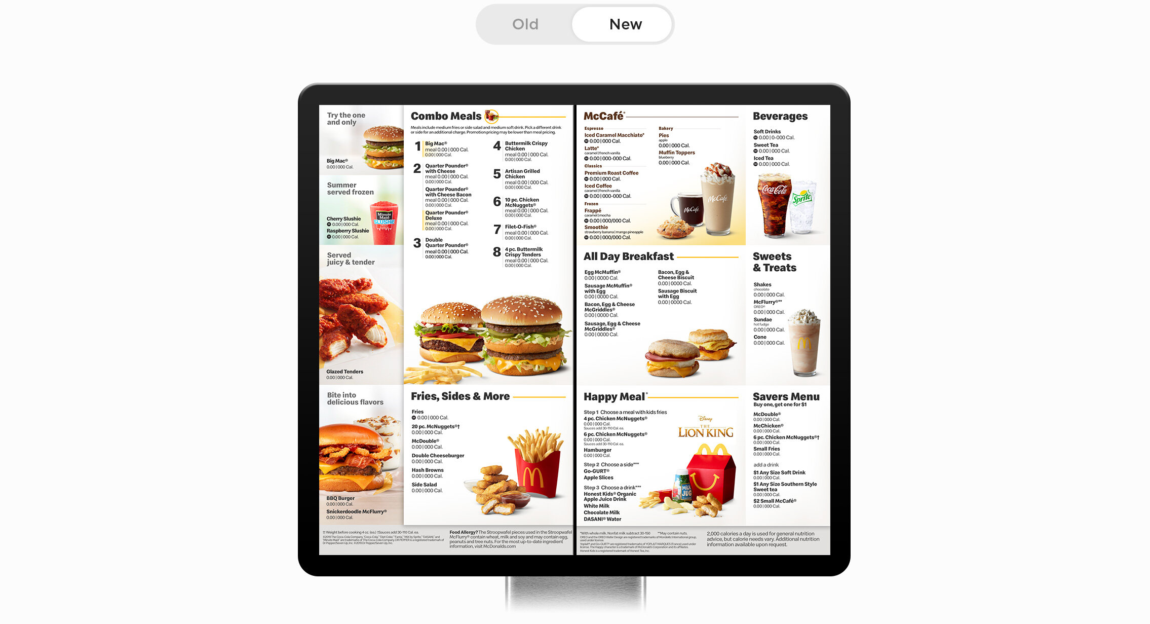
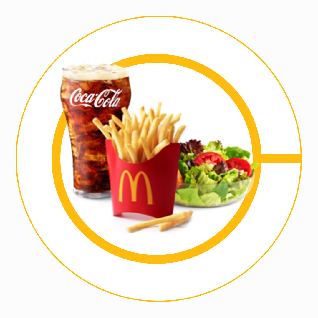
Similar to the in-store McDonald’s menus, the problem with the old menu style was it was too locked into a grid. That grid gave too much space to some categories and not enough for others. With the new menu, I wanted it to feel more open/spacious by giving it a clean white background. And I wanted your eye to move right to Mcdonald’s bread ‘n butter - the Combo Meals.
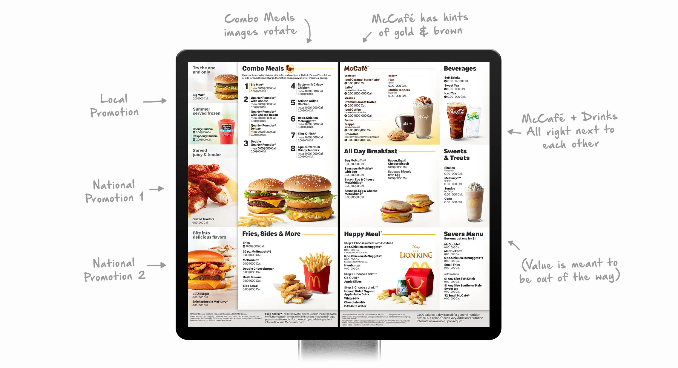
Some top level notes:
The ordering process.
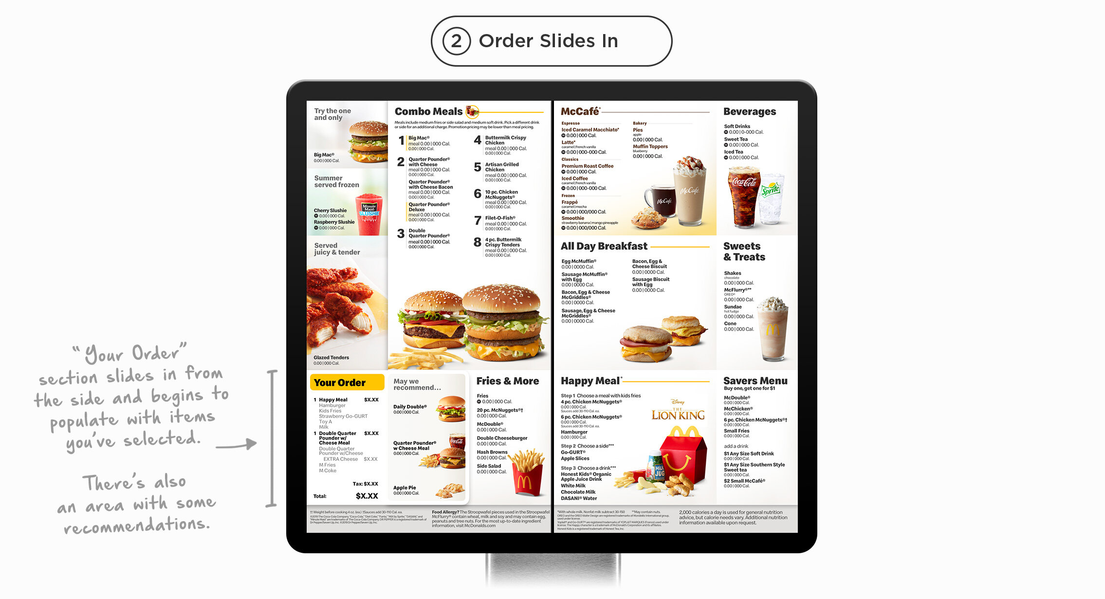
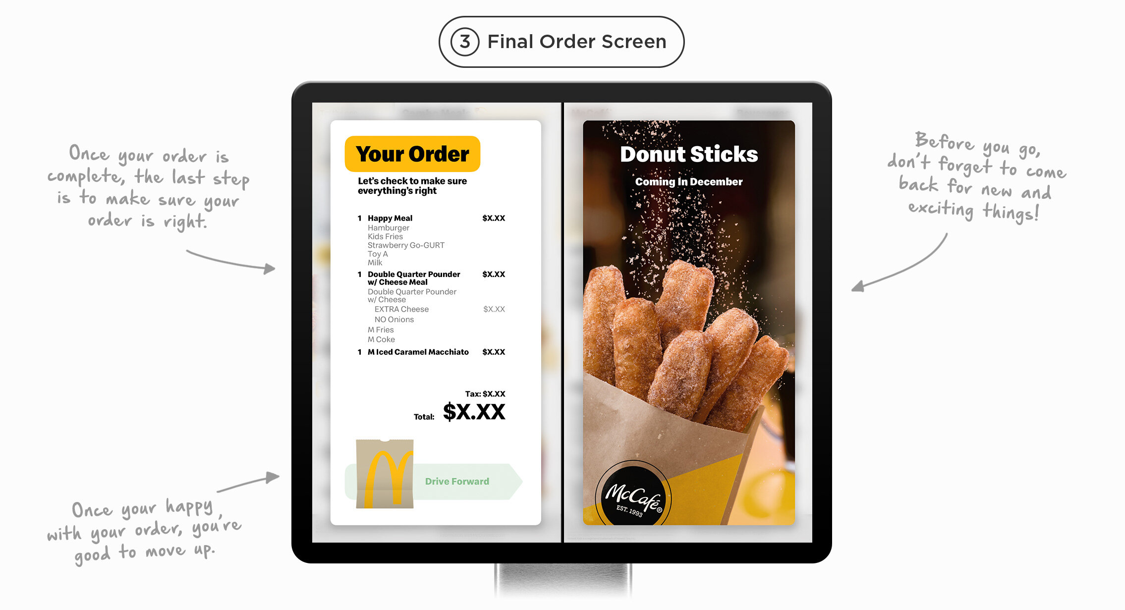
It’s all in the details:


Feel-Good Design
For my design, the new menu has a foundation built on the Feel-Good Design standards we helped establish for McDonald’s.
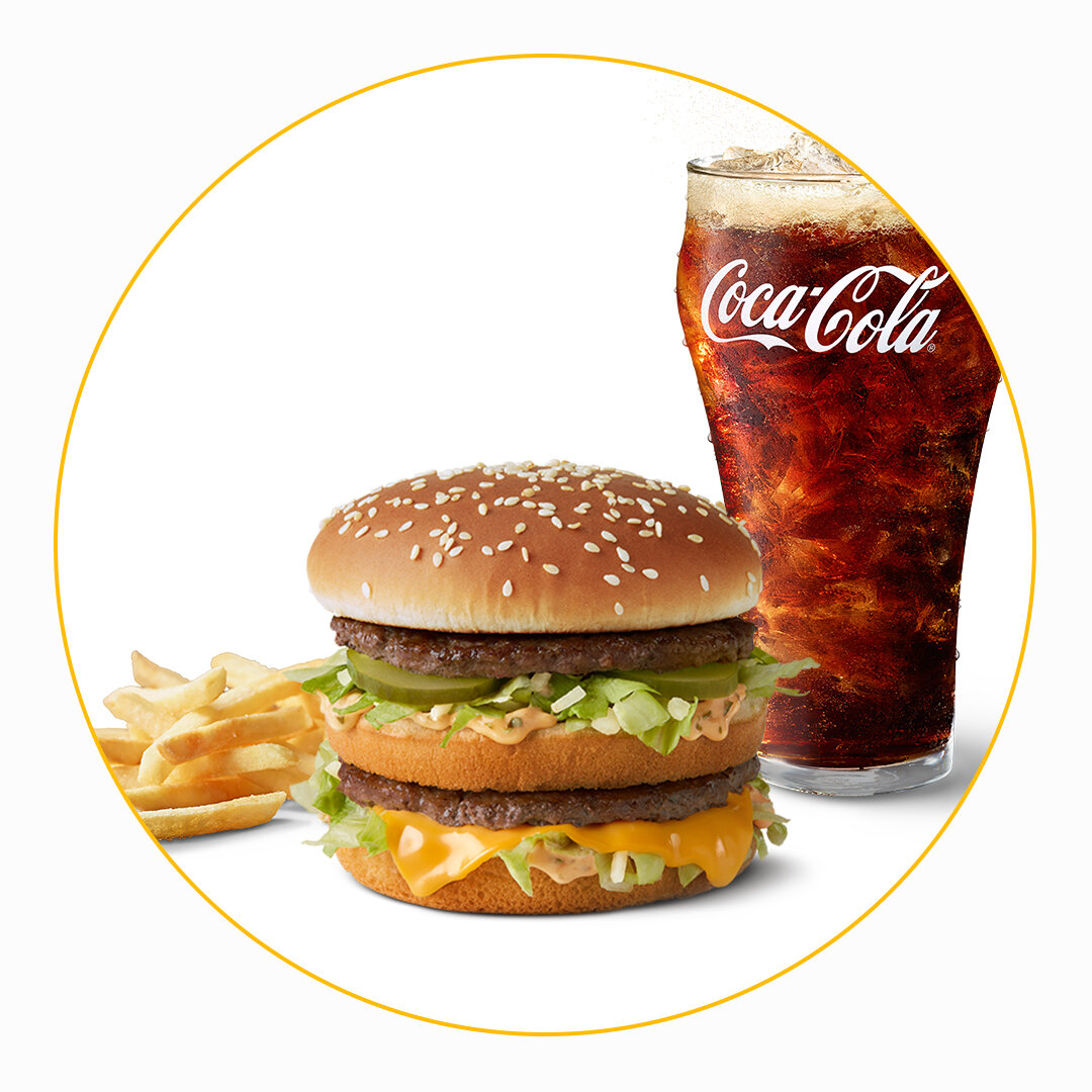
Images Dynamically Change
Replacing images has never been easier. all the menu items can easily be swapped with others.
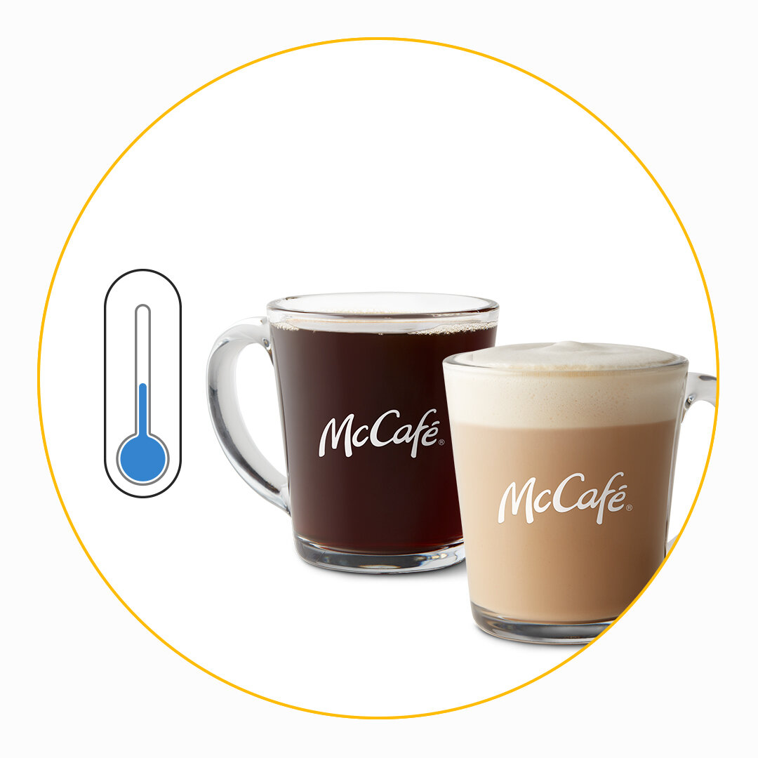
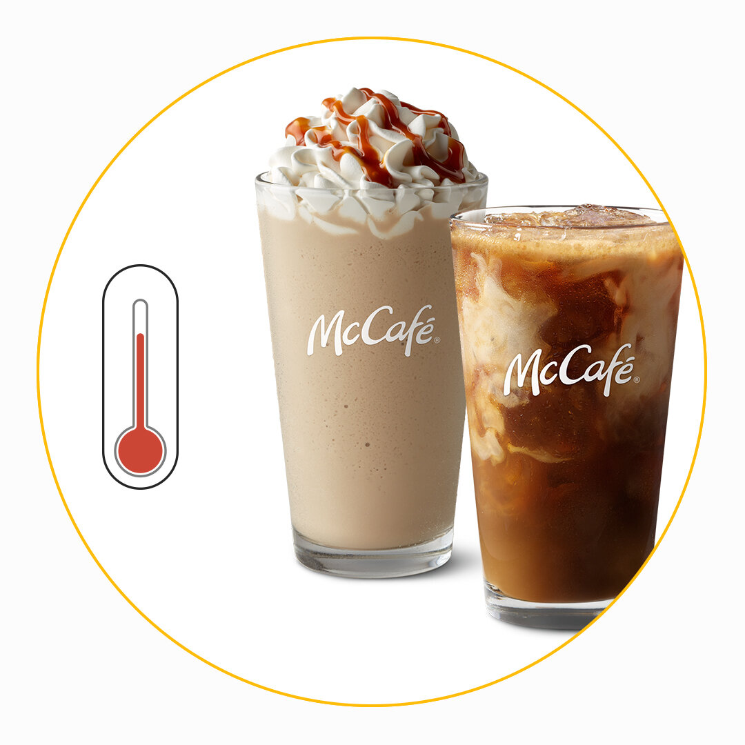
Weather Integration
McCafe drinks adapt to the weather conditions outside. If it’s hot, iced drinks are displayed. If it’s cold, hot drinks are shown.
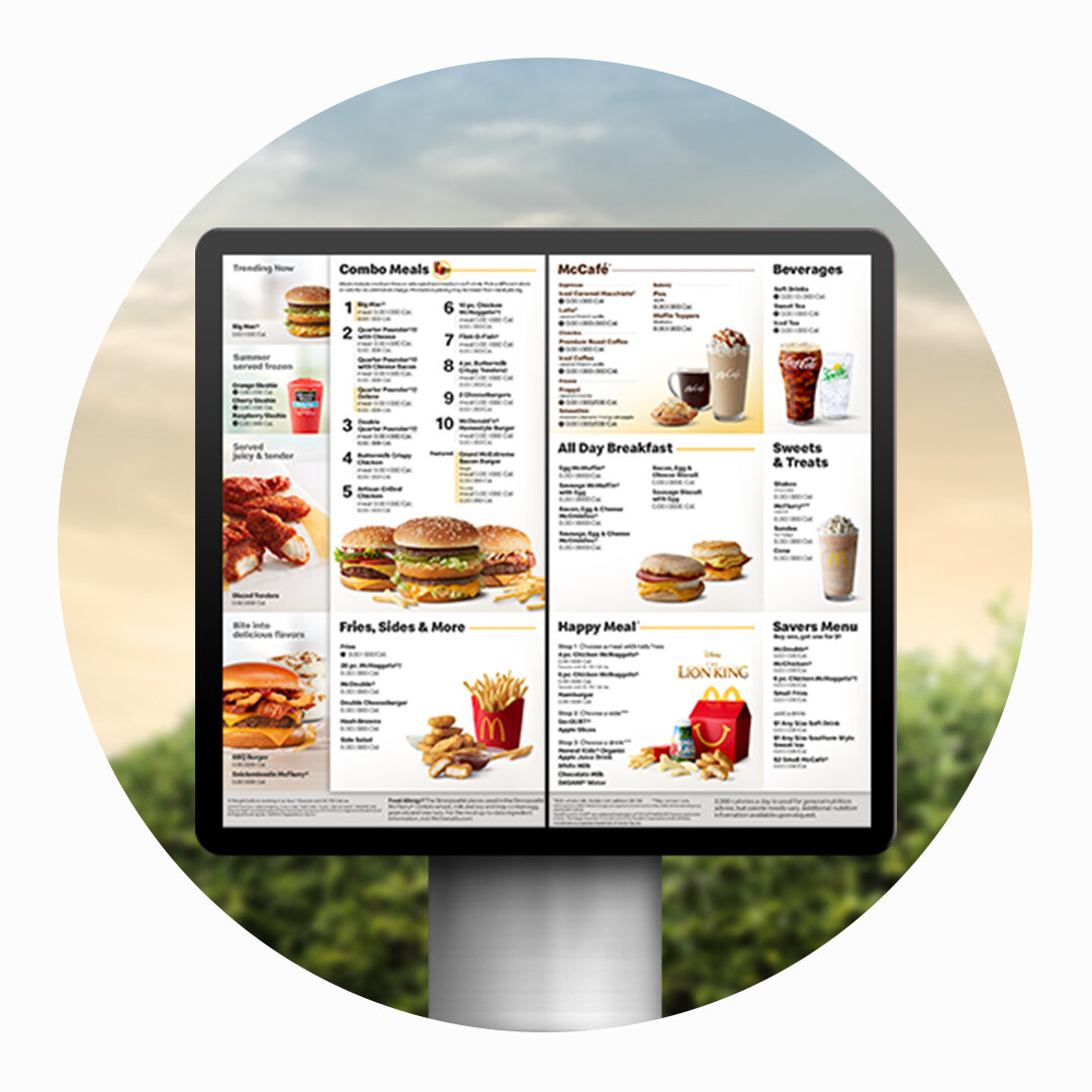
Two Menus, One Design
For the first time, the in-restaurant menu boards & drive thru menu share the same design.

![LOGO [Recovered]-13.png](https://images.squarespace-cdn.com/content/v1/5db5cda062d0152e8e43137b/1573330132626-EWT9TLG3TYYOS07JYU2J/LOGO+%5BRecovered%5D-13.png)