
Slate Identity
Designing the look & feel and website for Slate
I was asked to create the branding for a new color & post house called Slate. They specialize in color grading, compositing and finalizing footage.
Inspiration
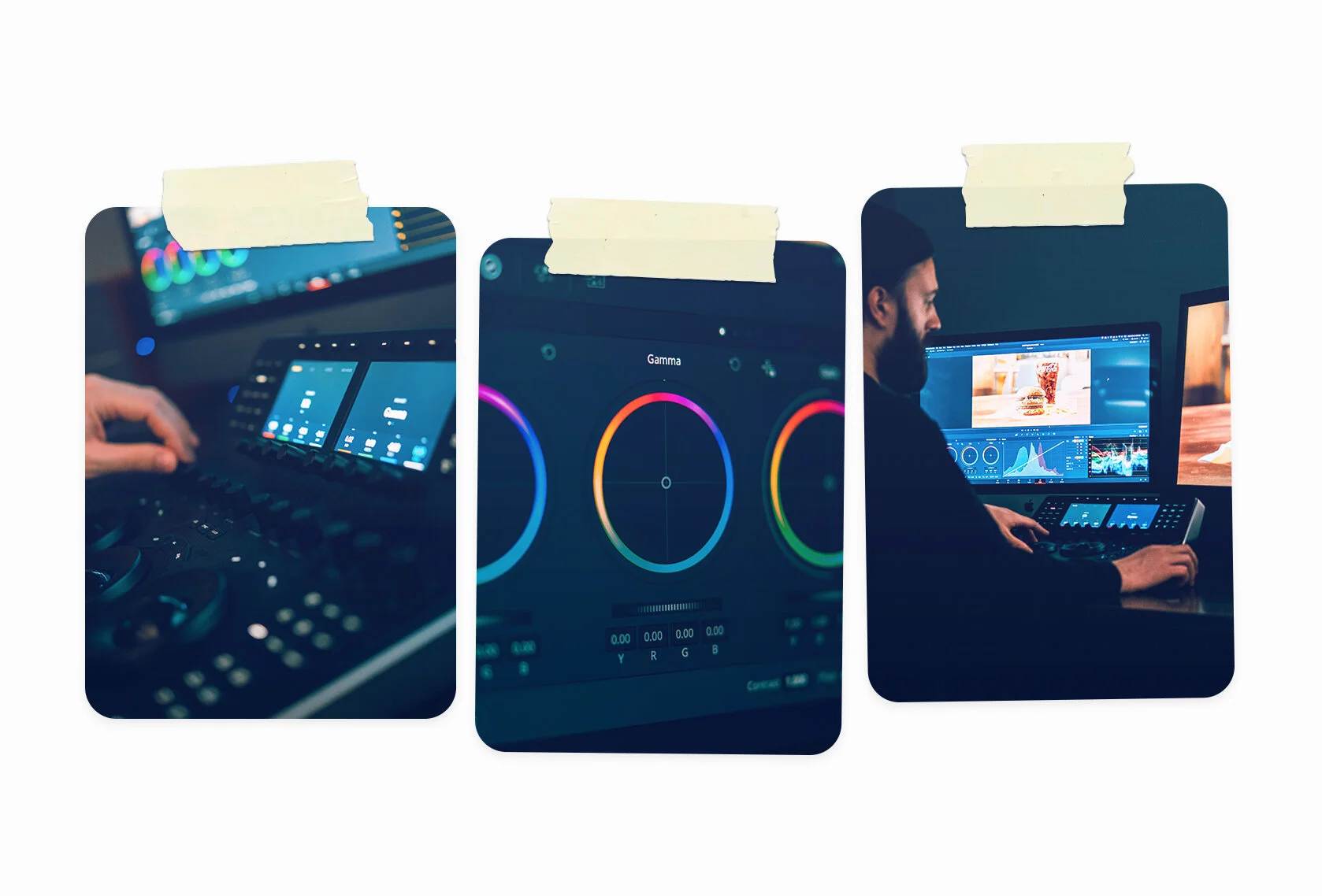
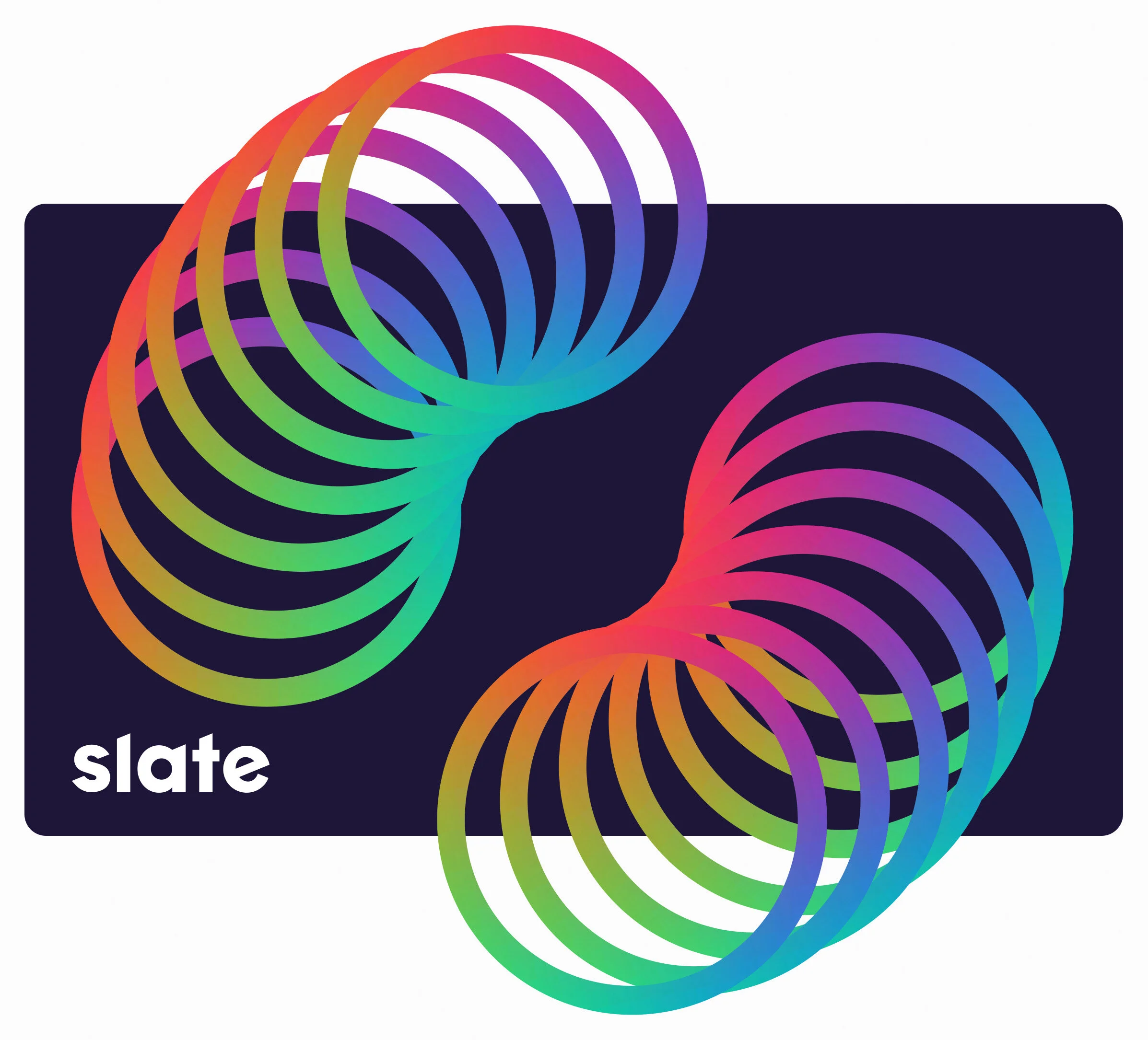
The color ring is a major part of the software the team uses in their day to day process. It was the spark that started the entire look of Slate.
Logo
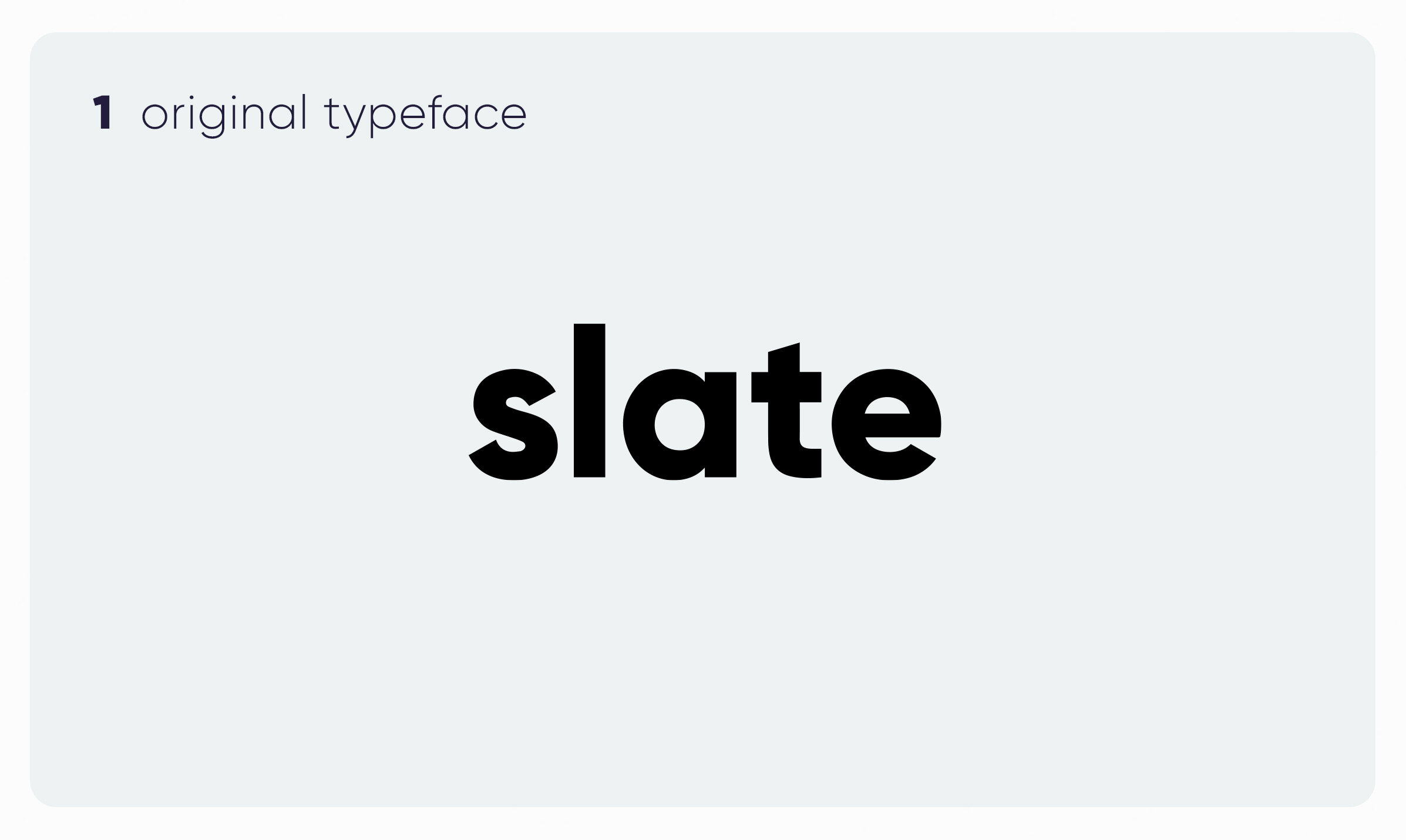
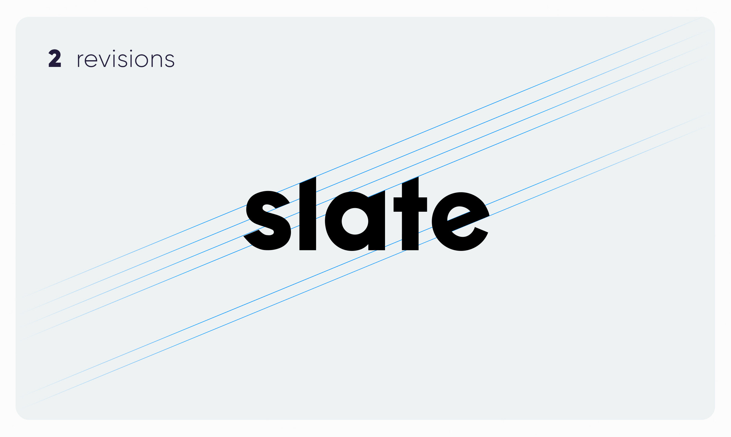
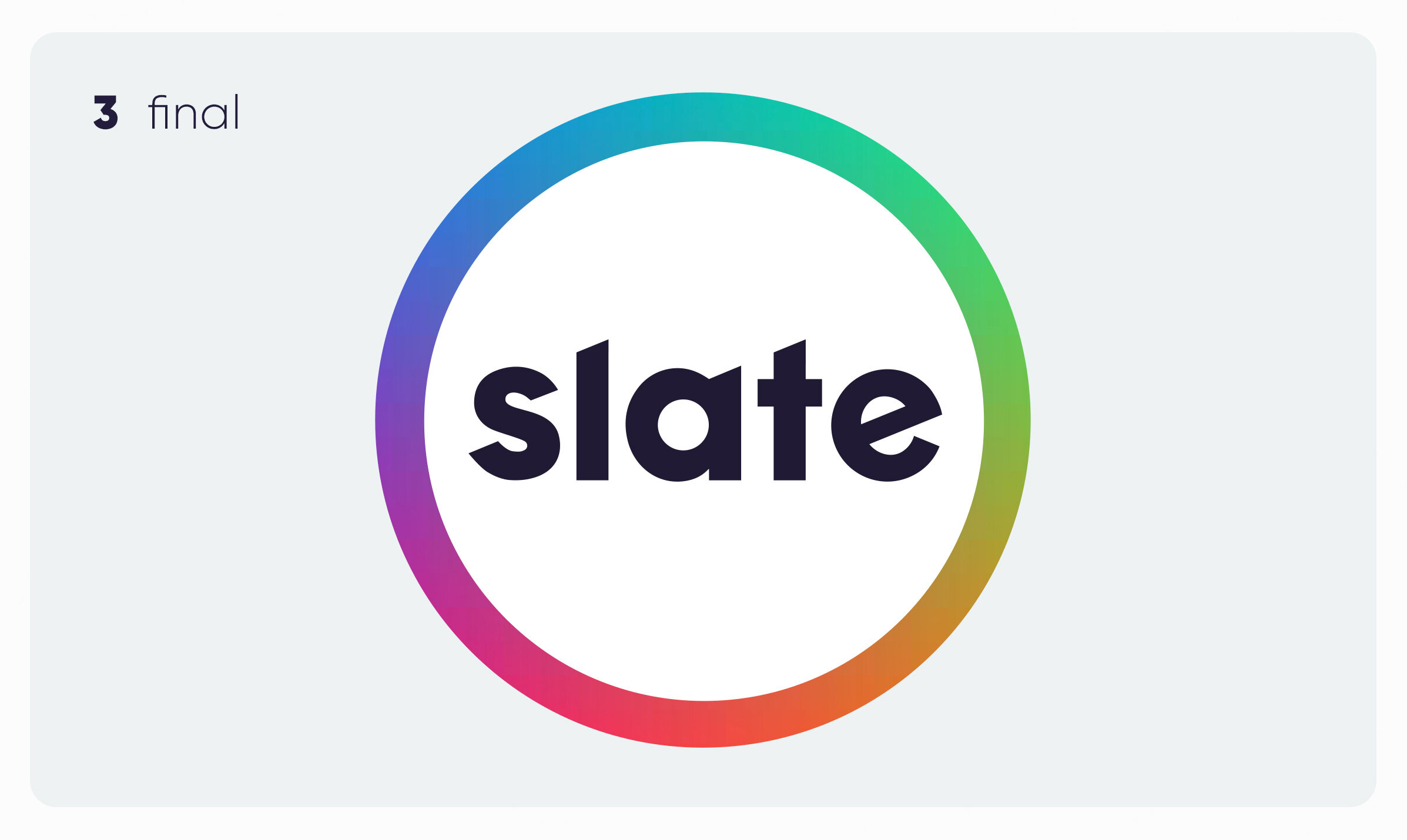
For Slate, I chose a typeface that felt strong/bold/simple. But to further simplify the logo, I kept all the typefaces’ ascenders constant with the same sloped angle.
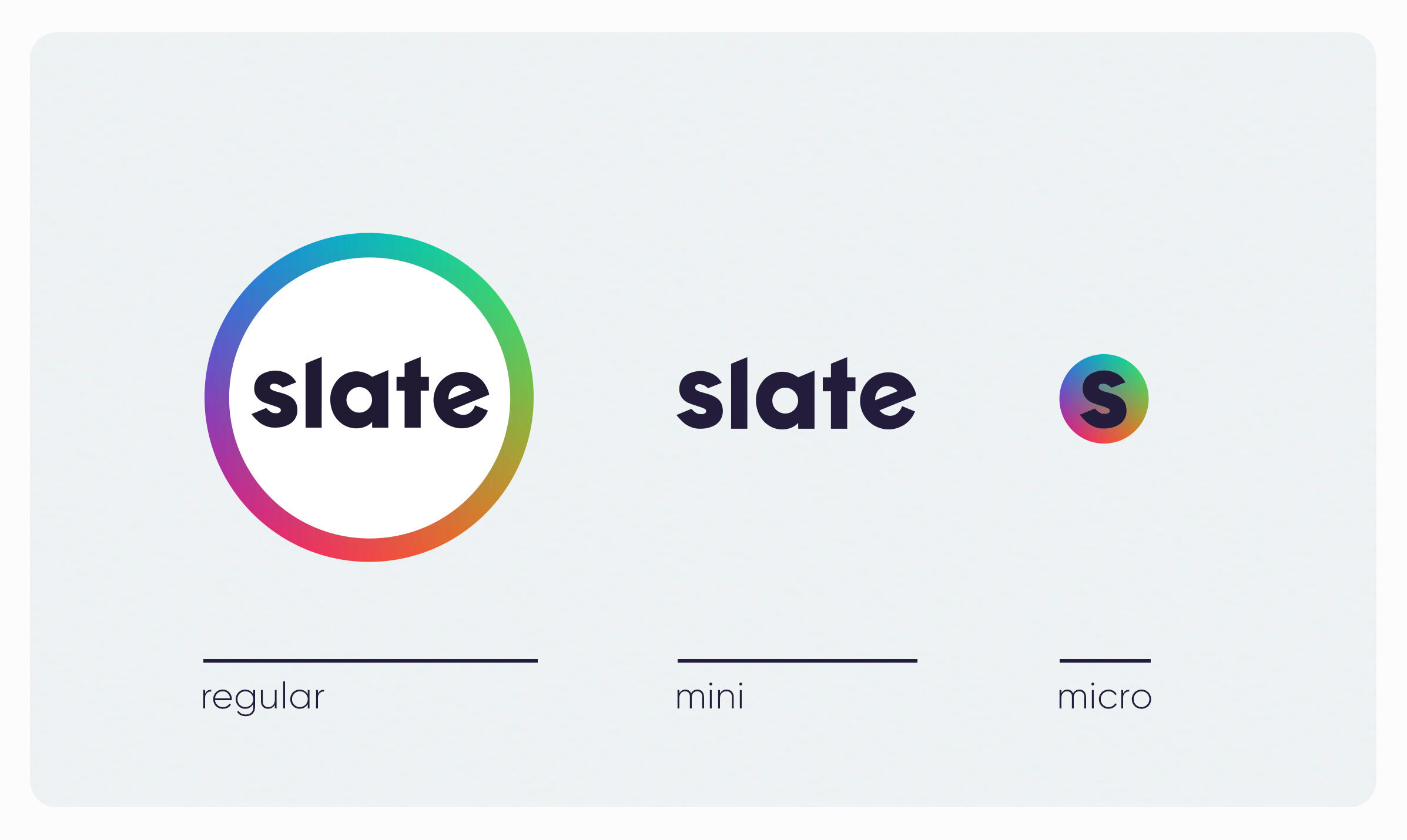
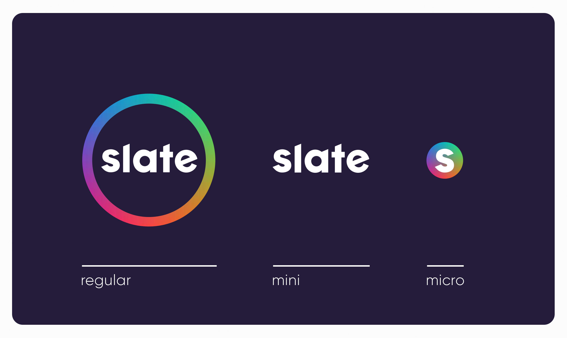
Logo Versions
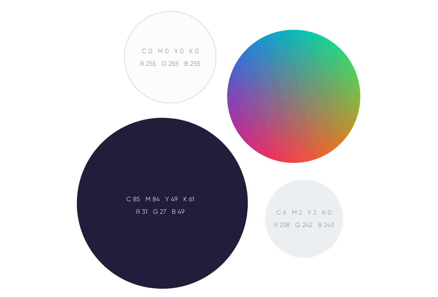
Color
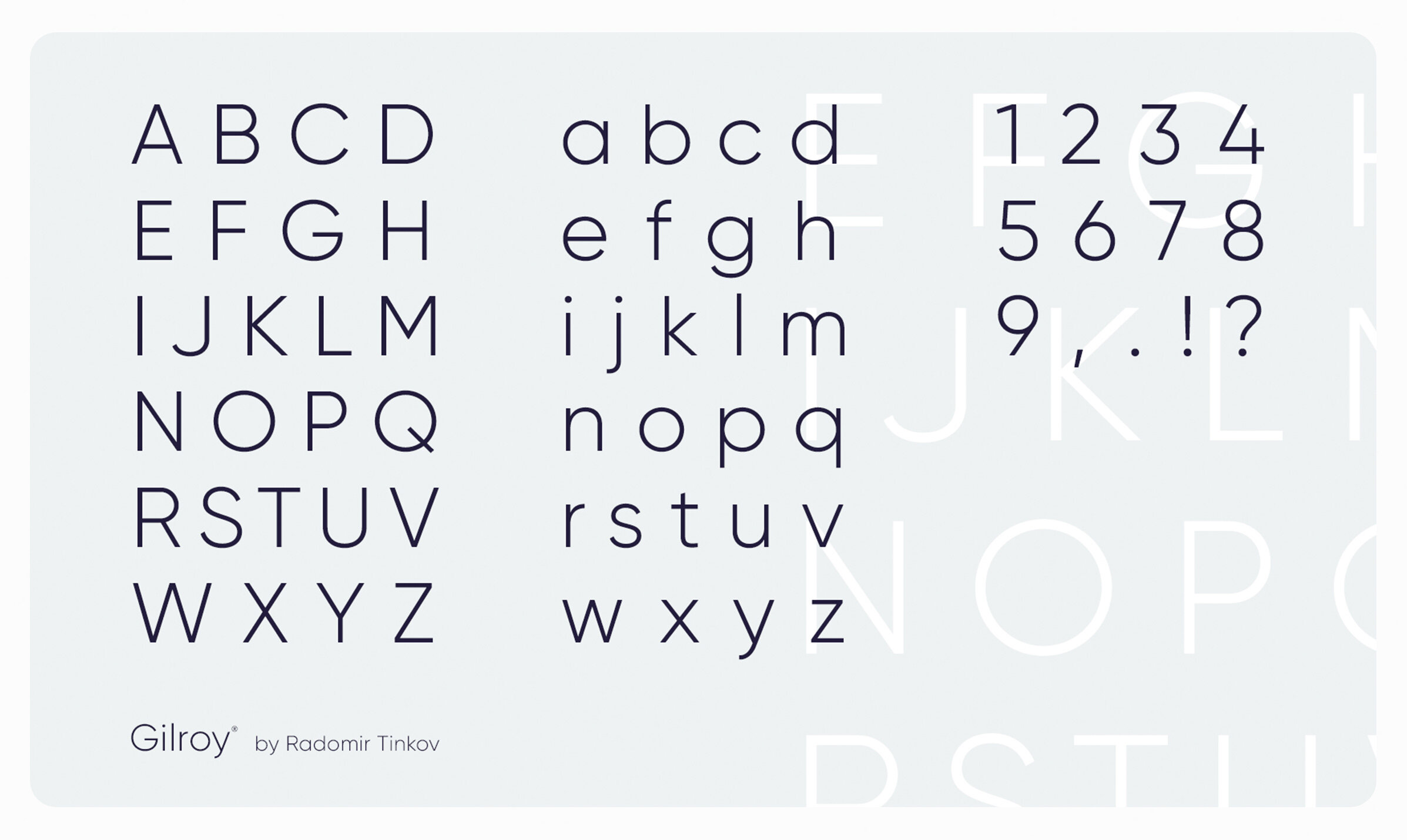
Typography
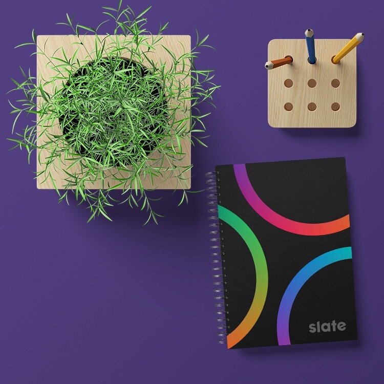
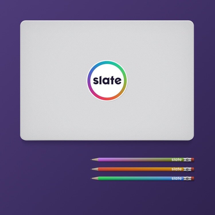
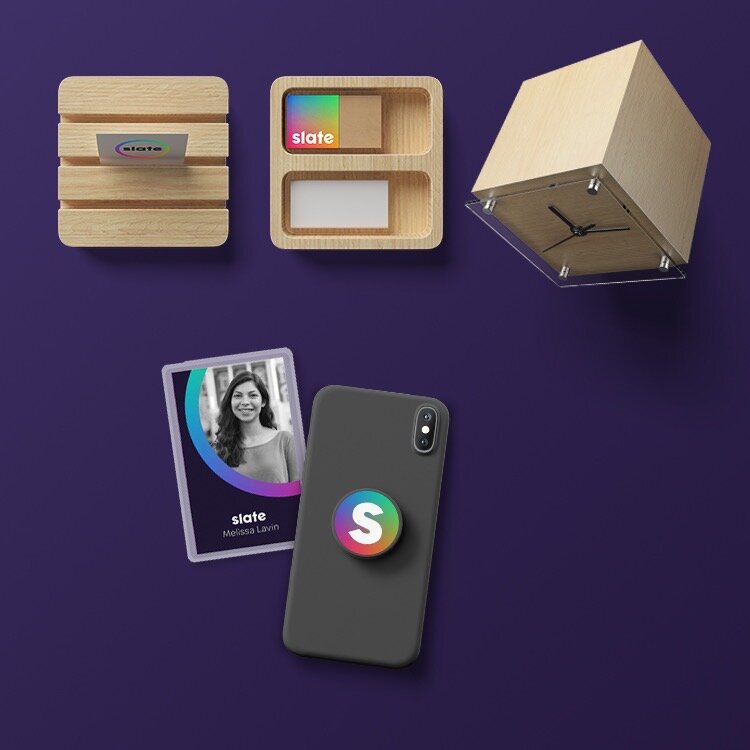
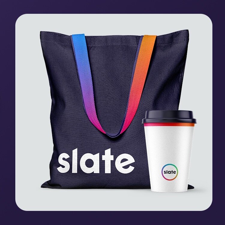
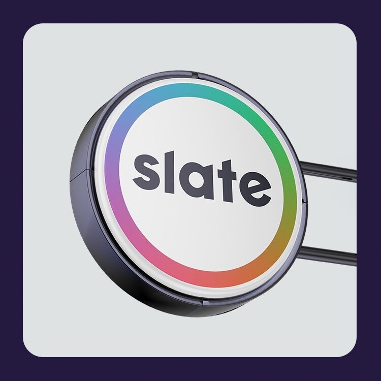
Slate Merch
Here’s a random assortment of fun slate merchandise I thought up from notebooks, pencils, stickers & Pop Sockets, to branded bags, cups and even erasers. Nothing’s safe from being Slate branded.
Slate Website
I wanted the website to also go with the look and feel of slate. The site acts as a quick and simple way to show off all the capabilities they offer as well as give potential clients a way of reaching out to them.
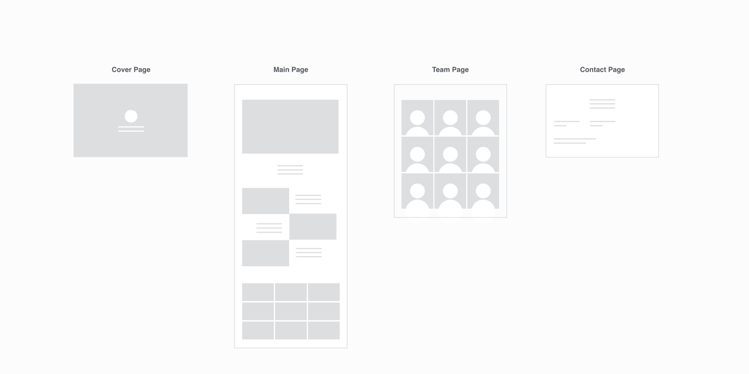
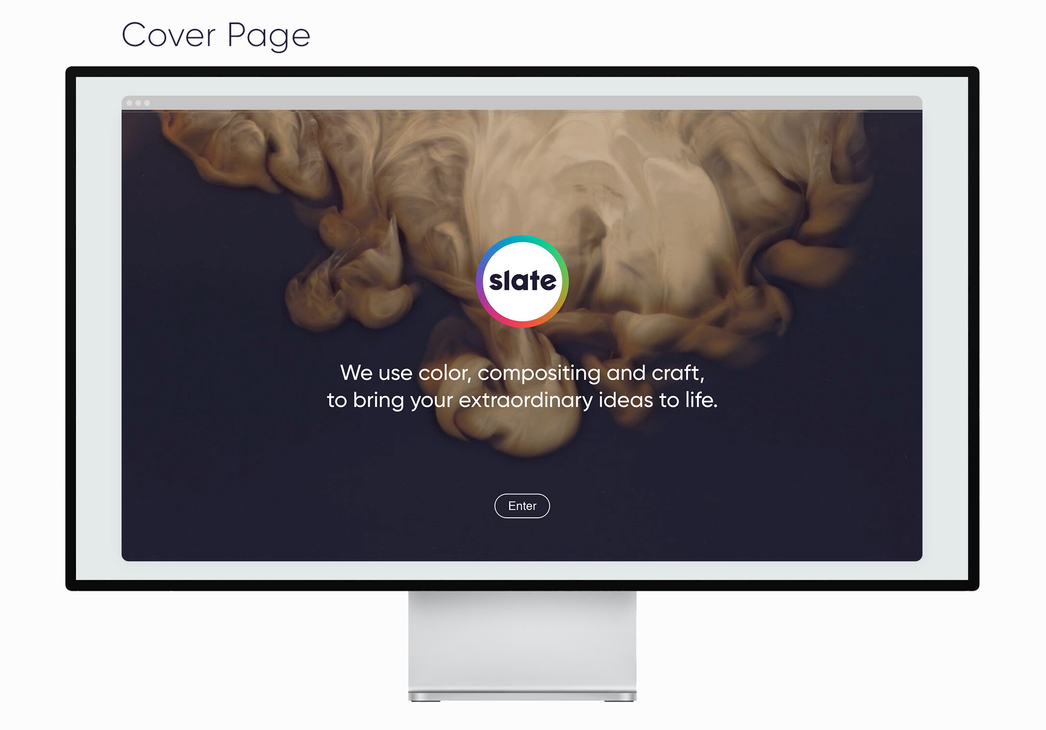
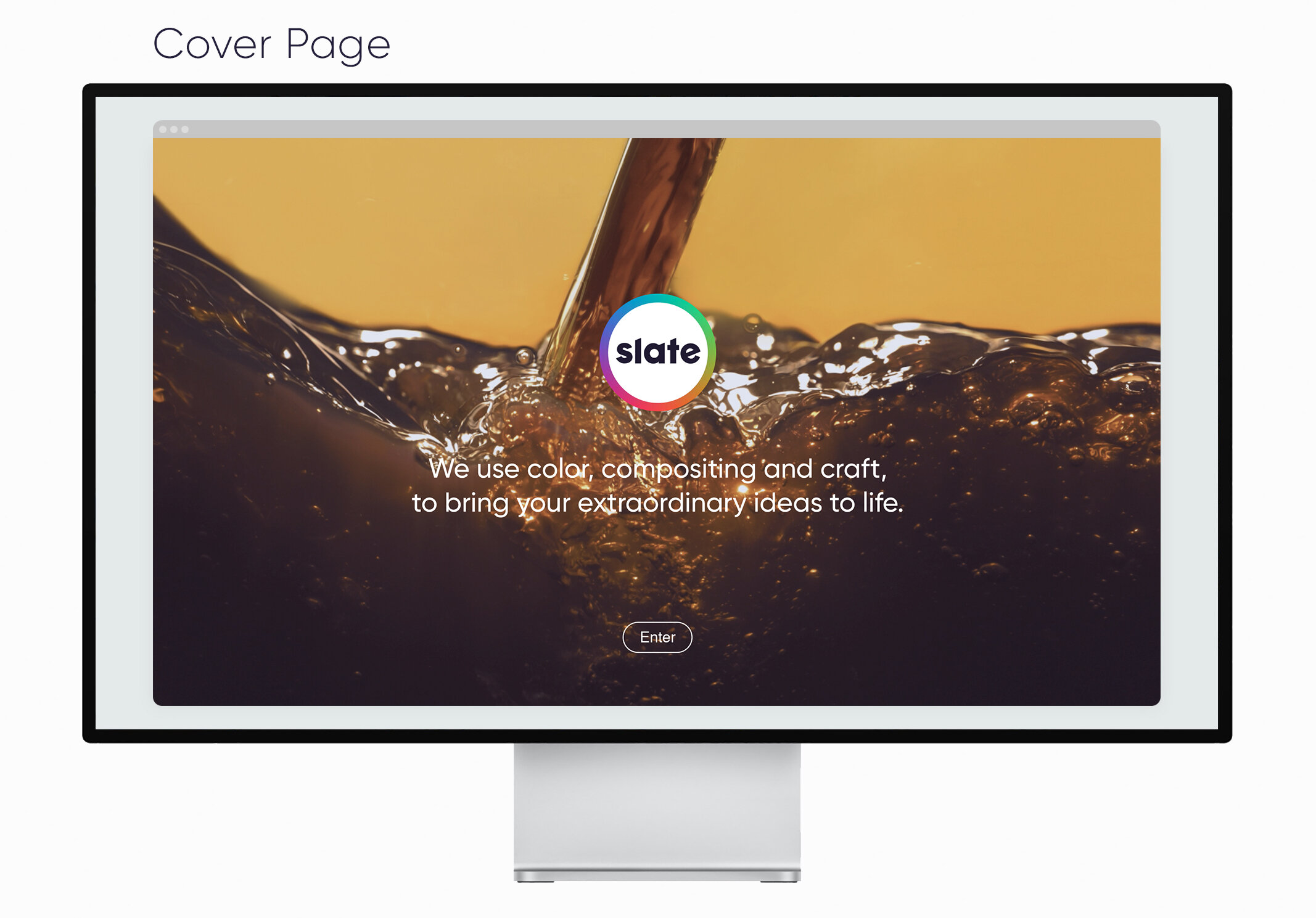
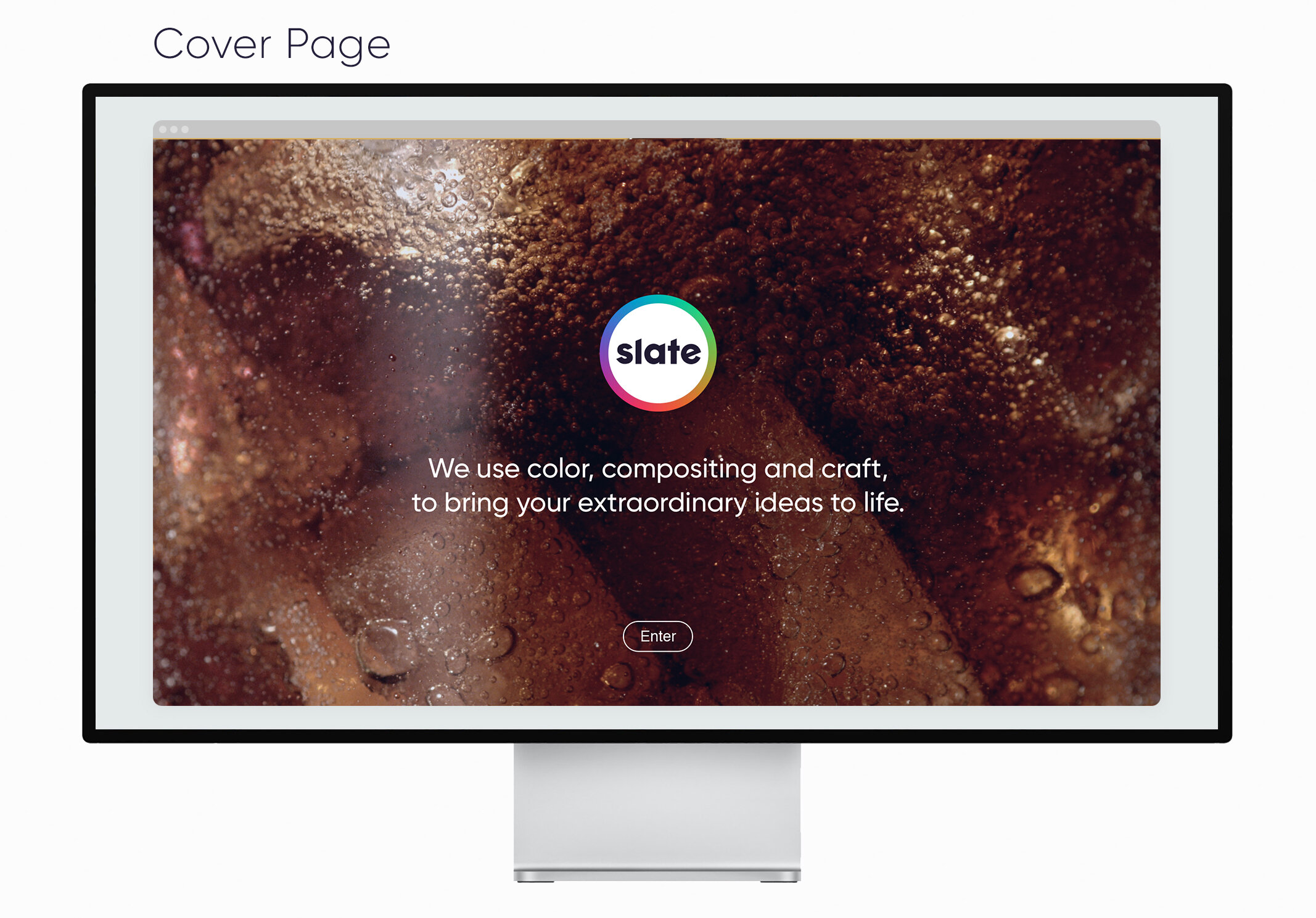
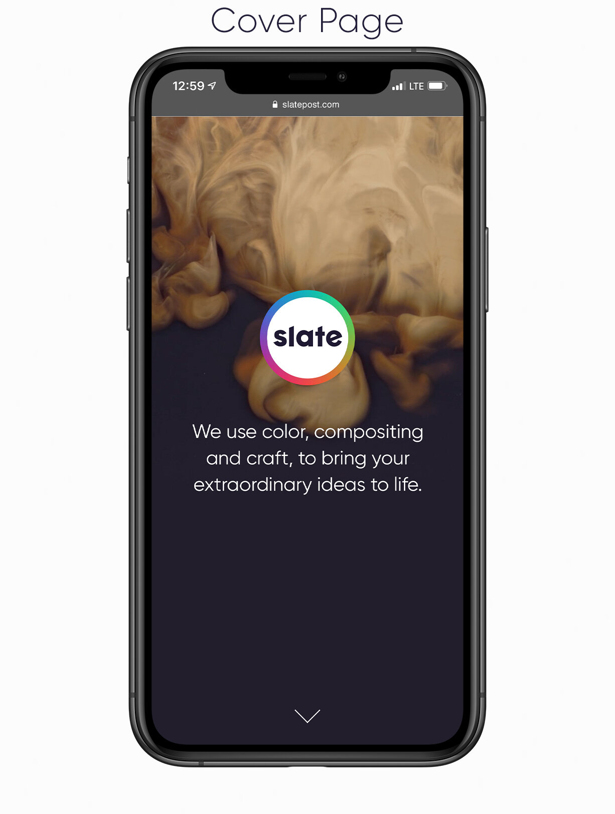
Cover Page: Teases some slow motion footage Slate has worked on.
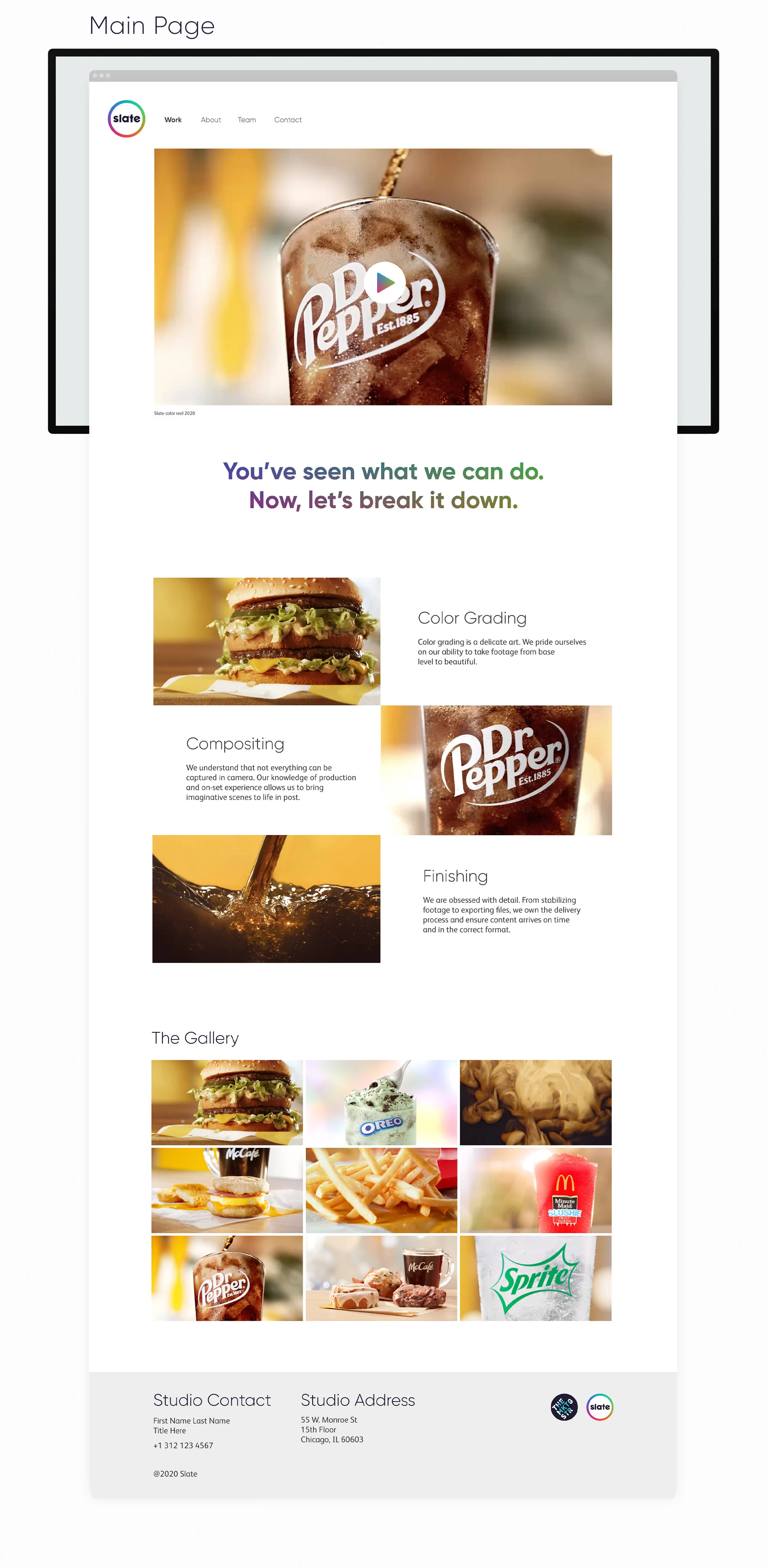
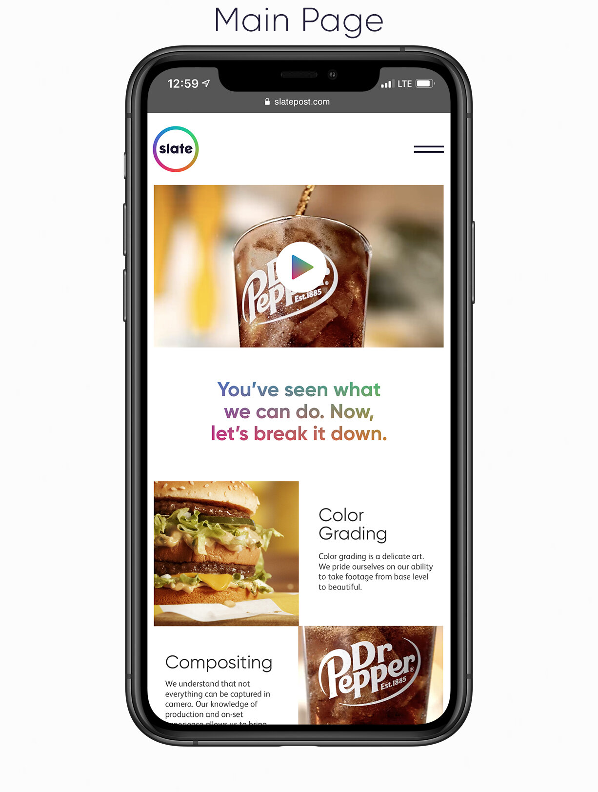
Main Page: The main page is broken up into three parts. 1) The main slate color reel. 2) Three fast gifs that breakdown things they offer. 3) A gallery of videos Slate has produced.
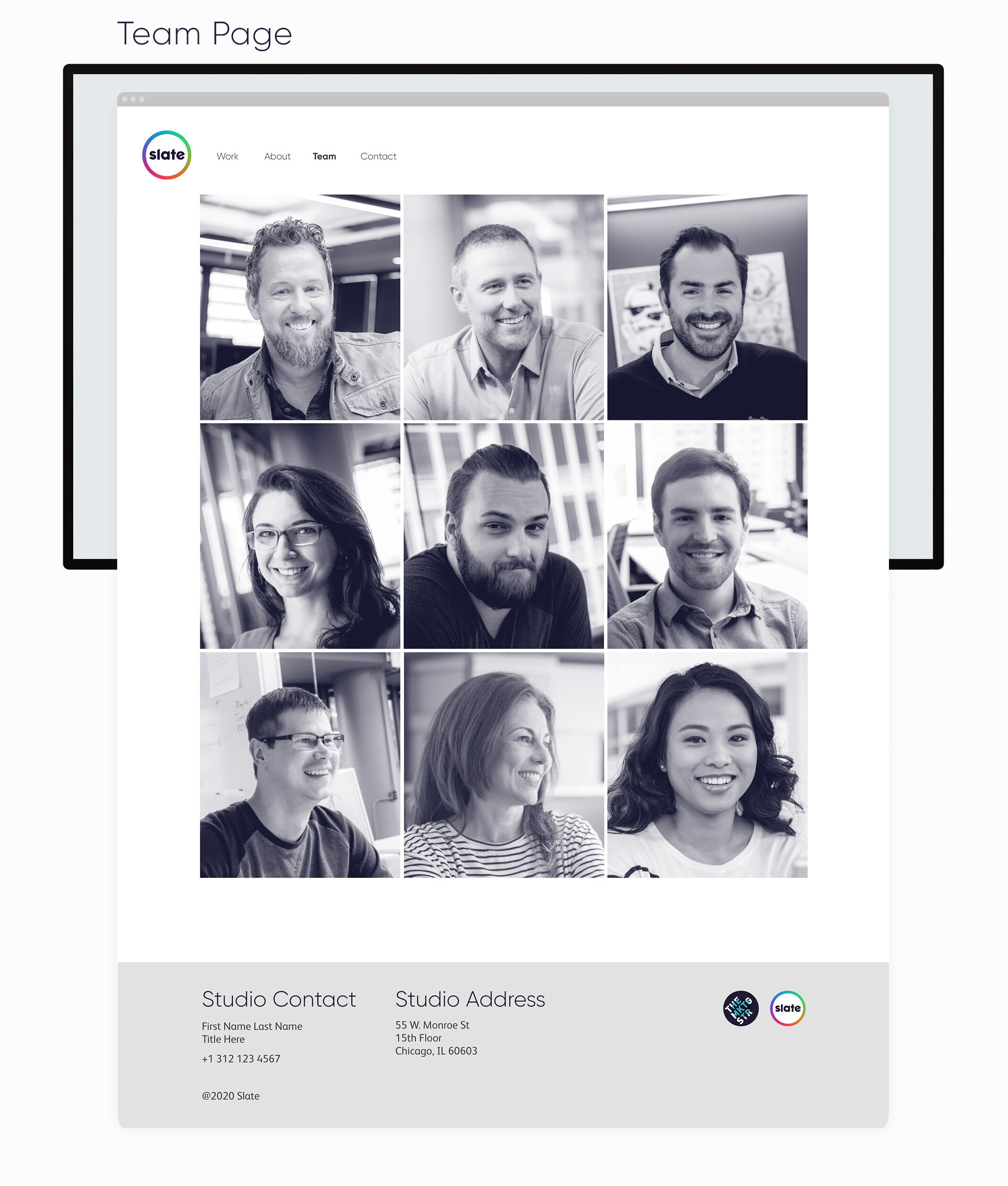
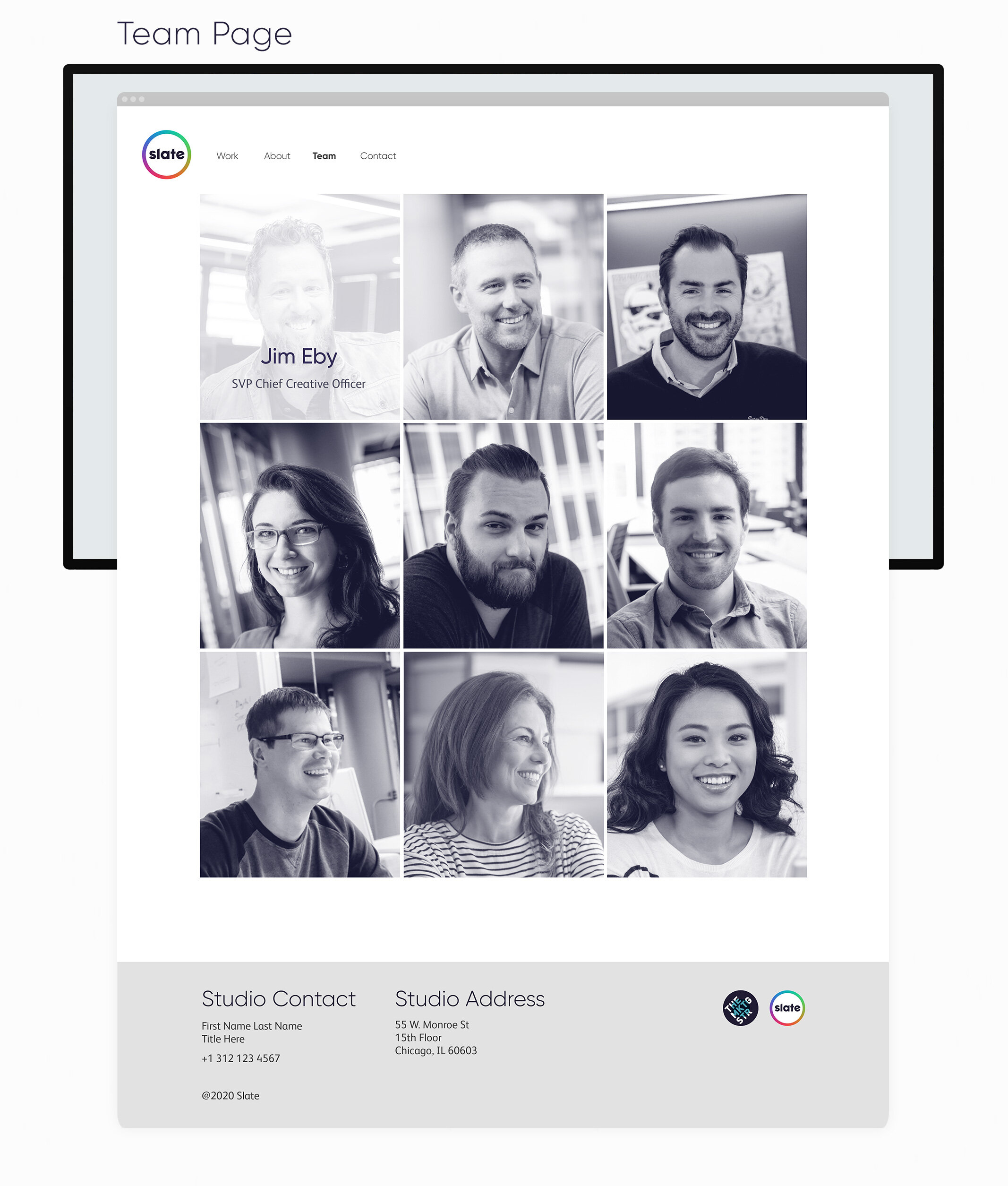
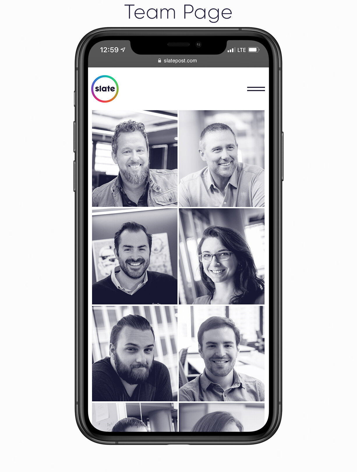
Team Page: My favorite page, gives you a glimpse into the kind of people who work at Slate. When you hover over a portrait, it shows a quirky extra image that represents them.
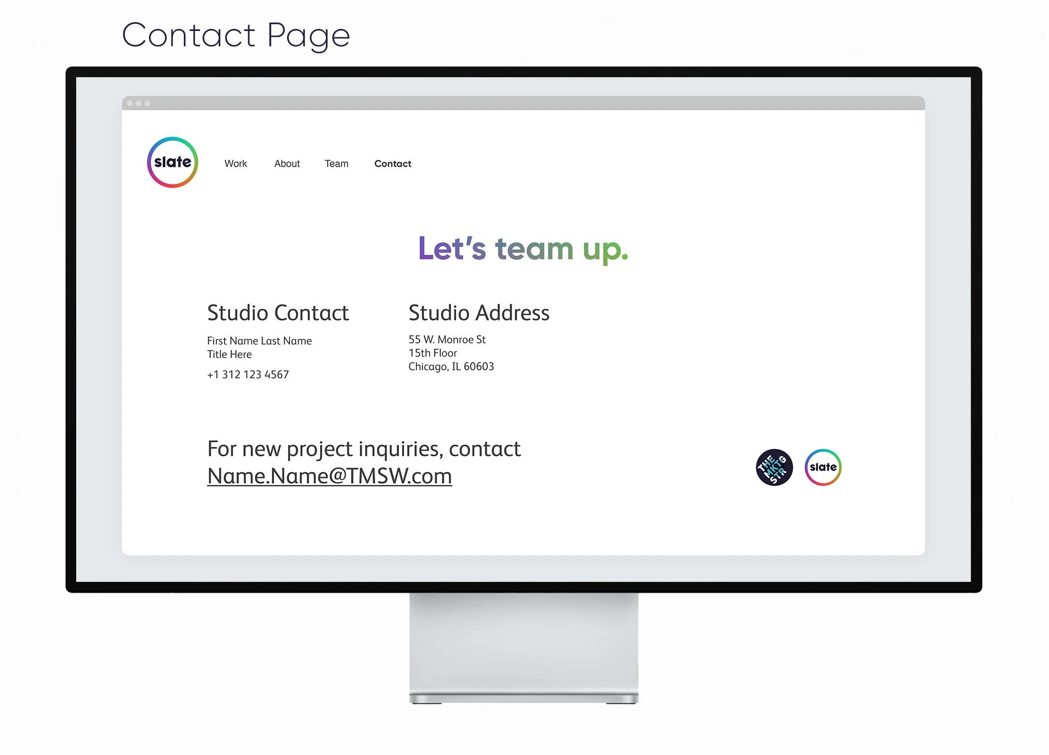
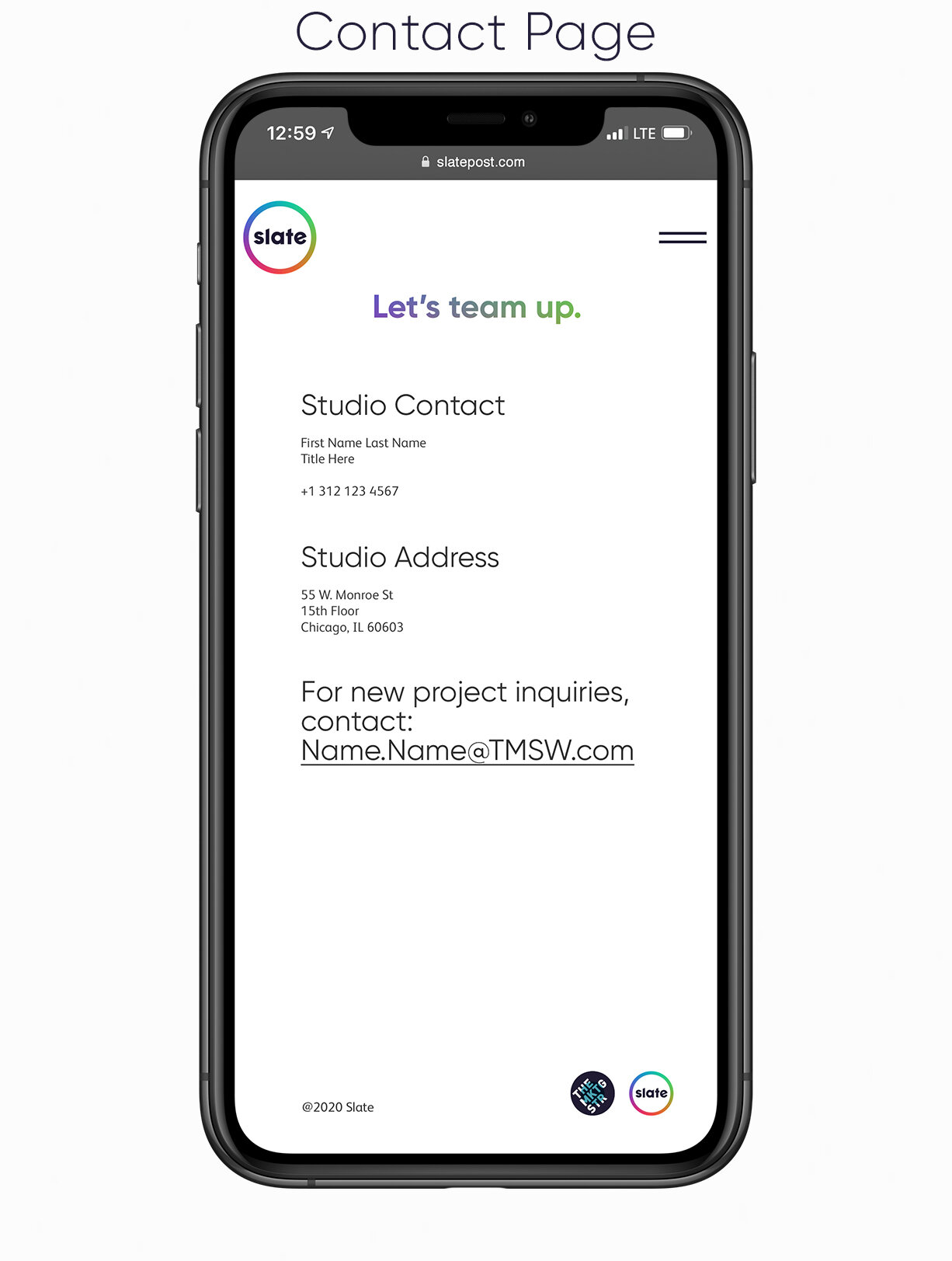
Contact Page: Made simple and easy to contact Slate for future projects.
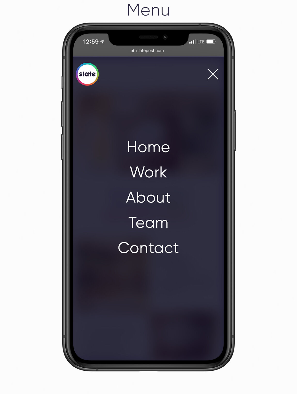
Mobile Site
![LOGO [Recovered]2-27.png](https://images.squarespace-cdn.com/content/v1/5db5cda062d0152e8e43137b/1581424187364-EY4F4FWOA0061NF7NXYU/LOGO+%5BRecovered%5D2-27.png)