
McDonald’s Food Design System
Creating the perfect, imperfect images of McDonald’s food.
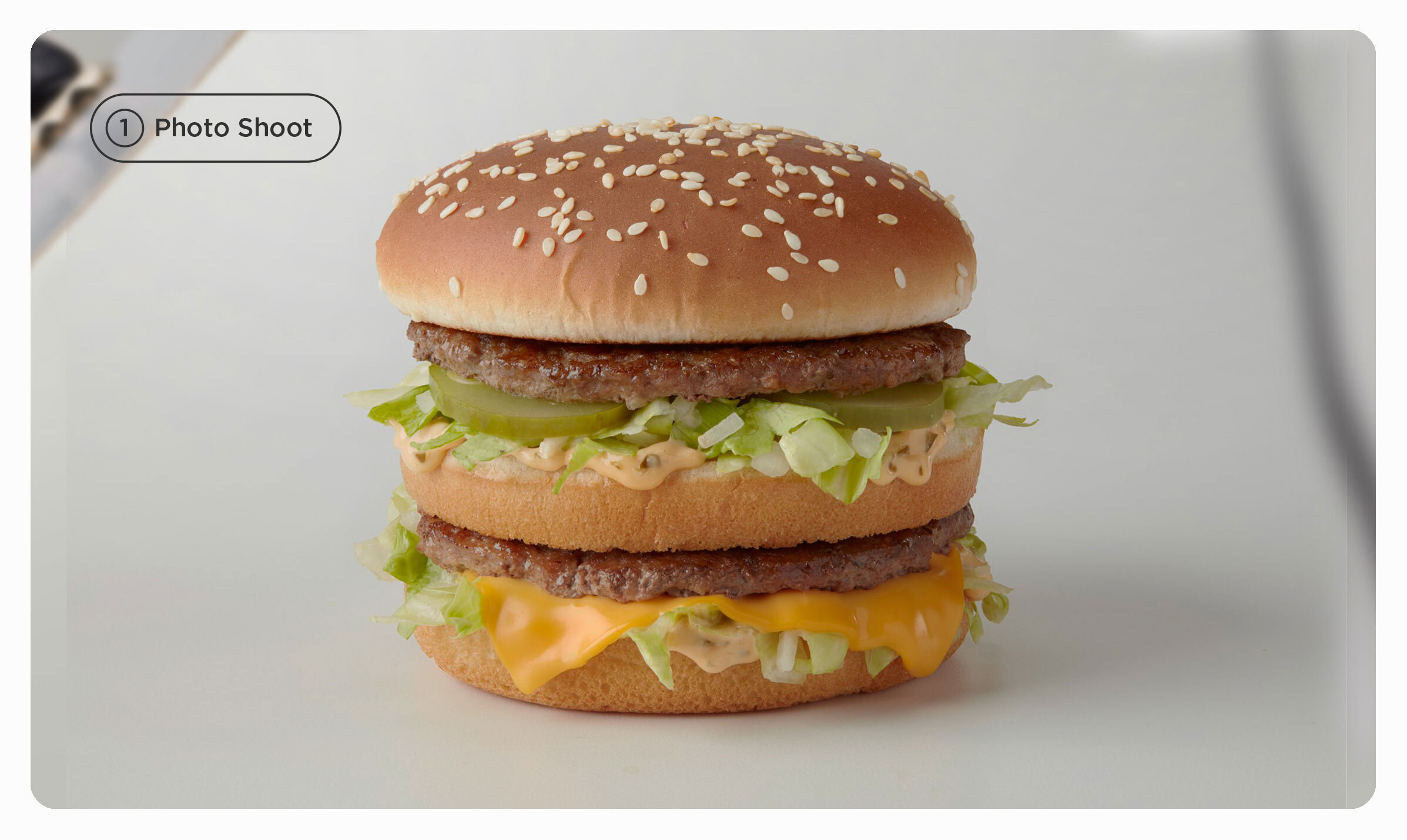
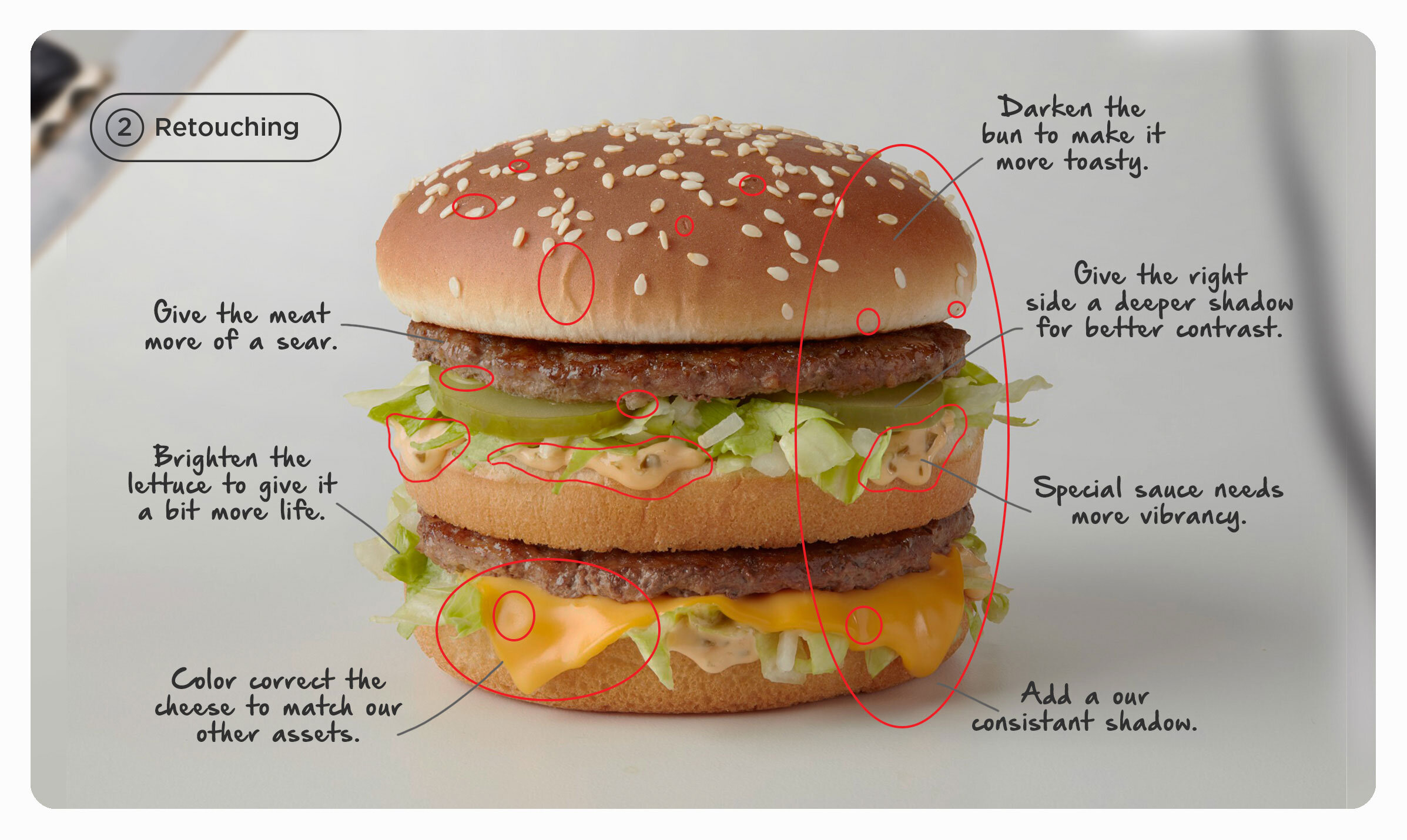
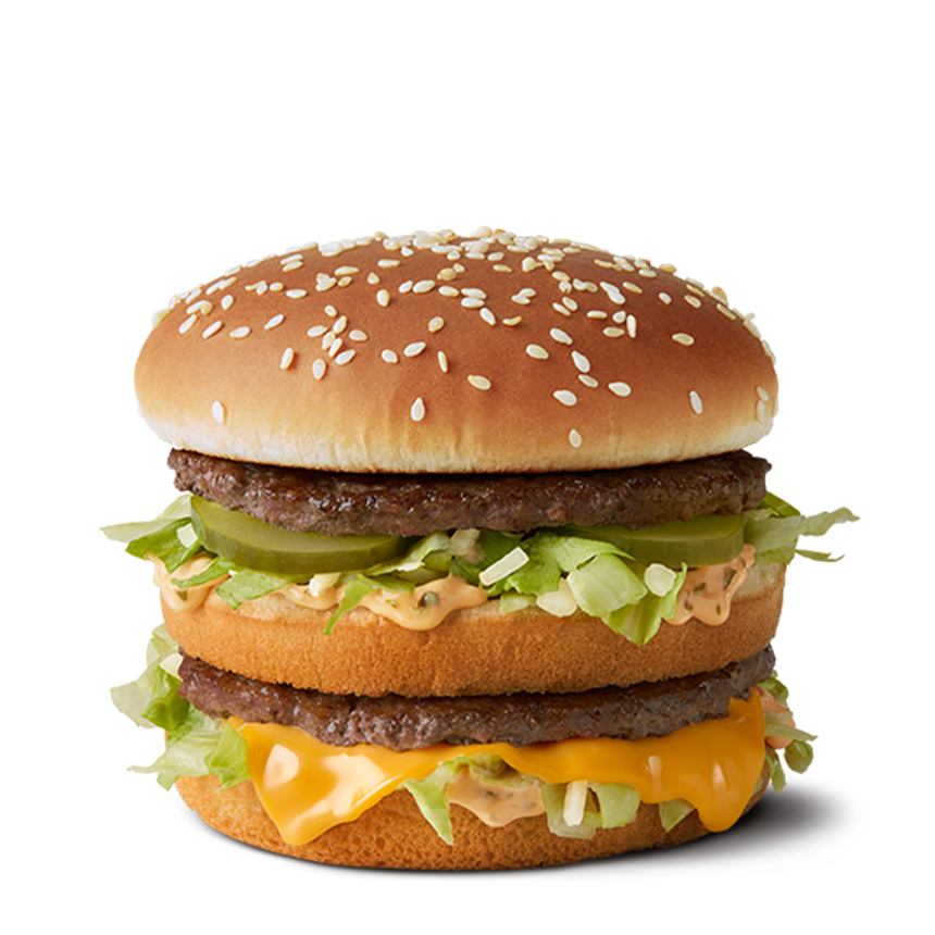
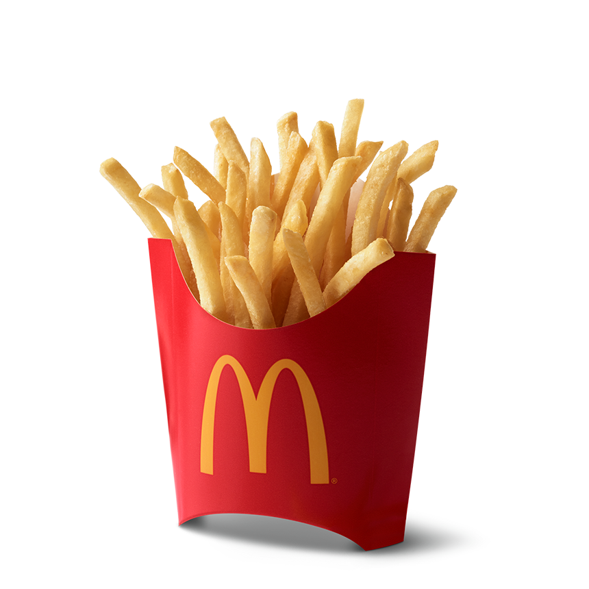
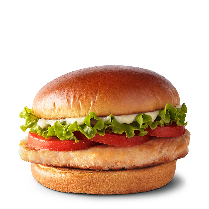
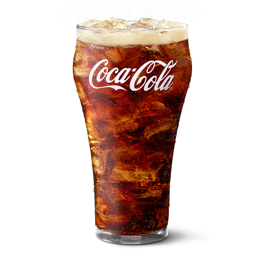
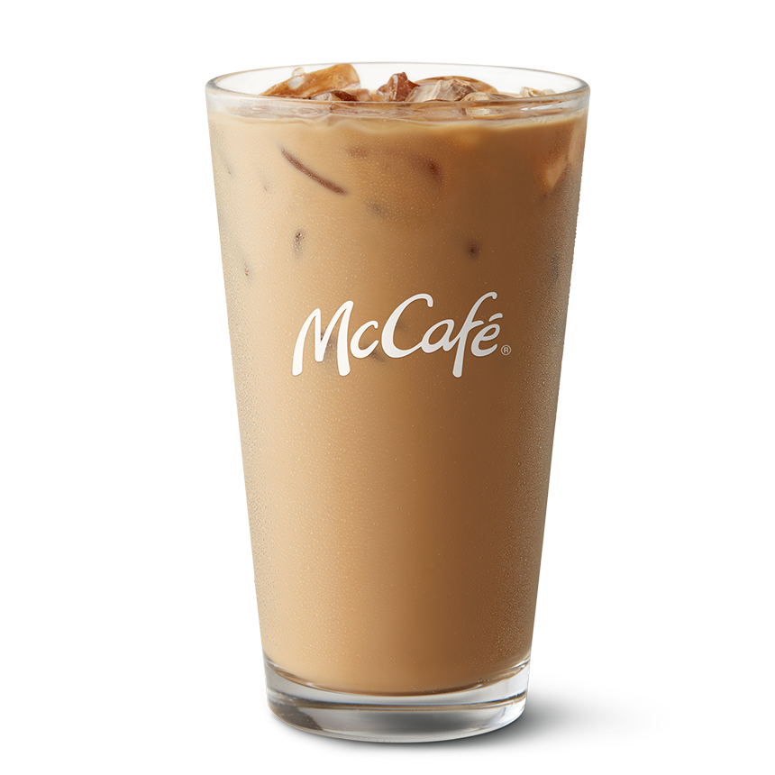
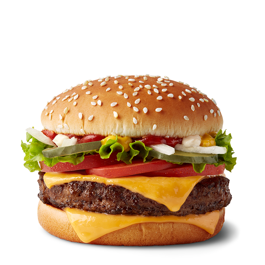
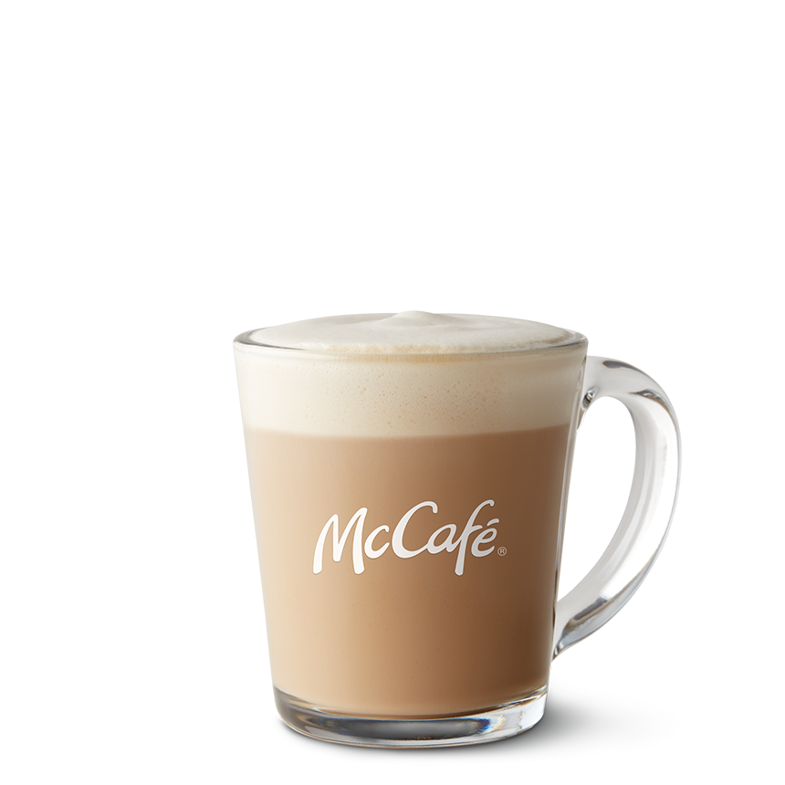
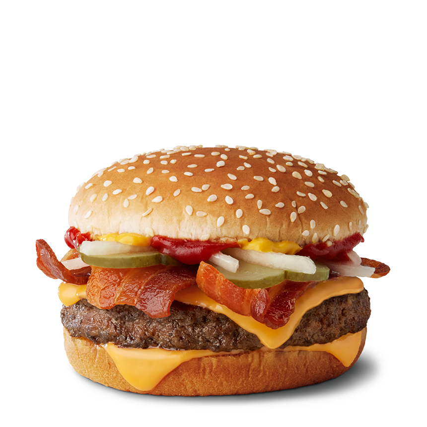
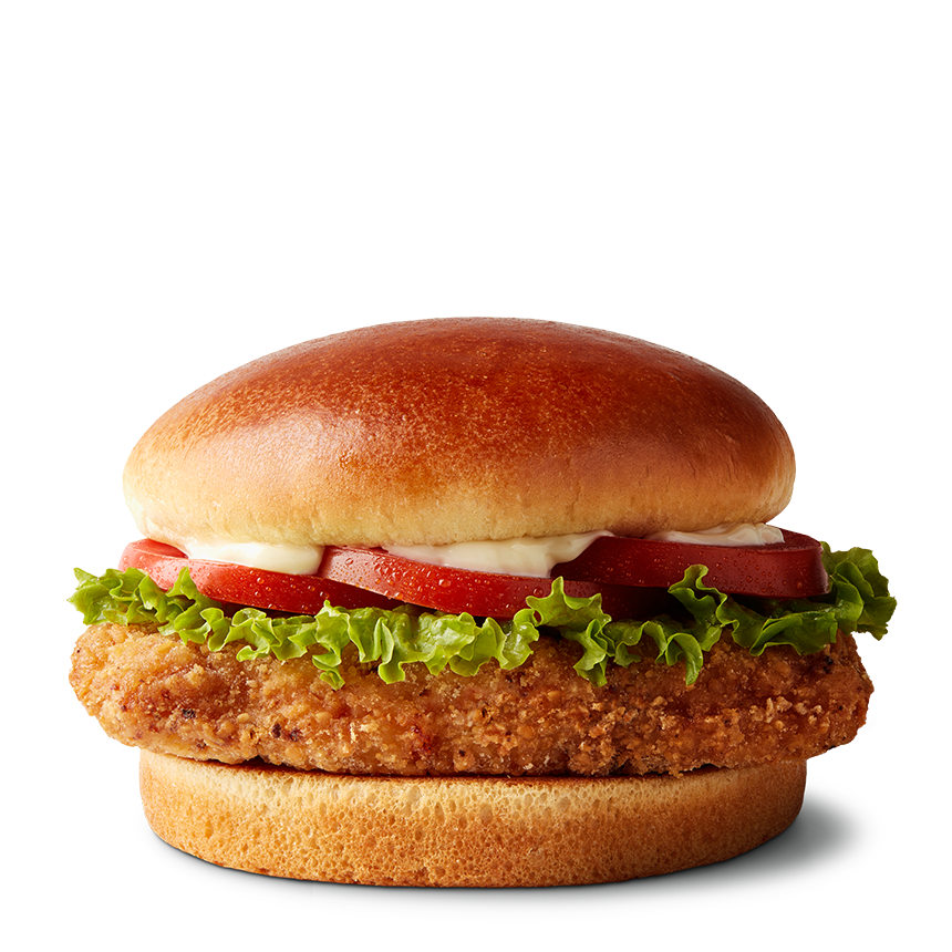
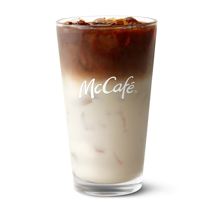
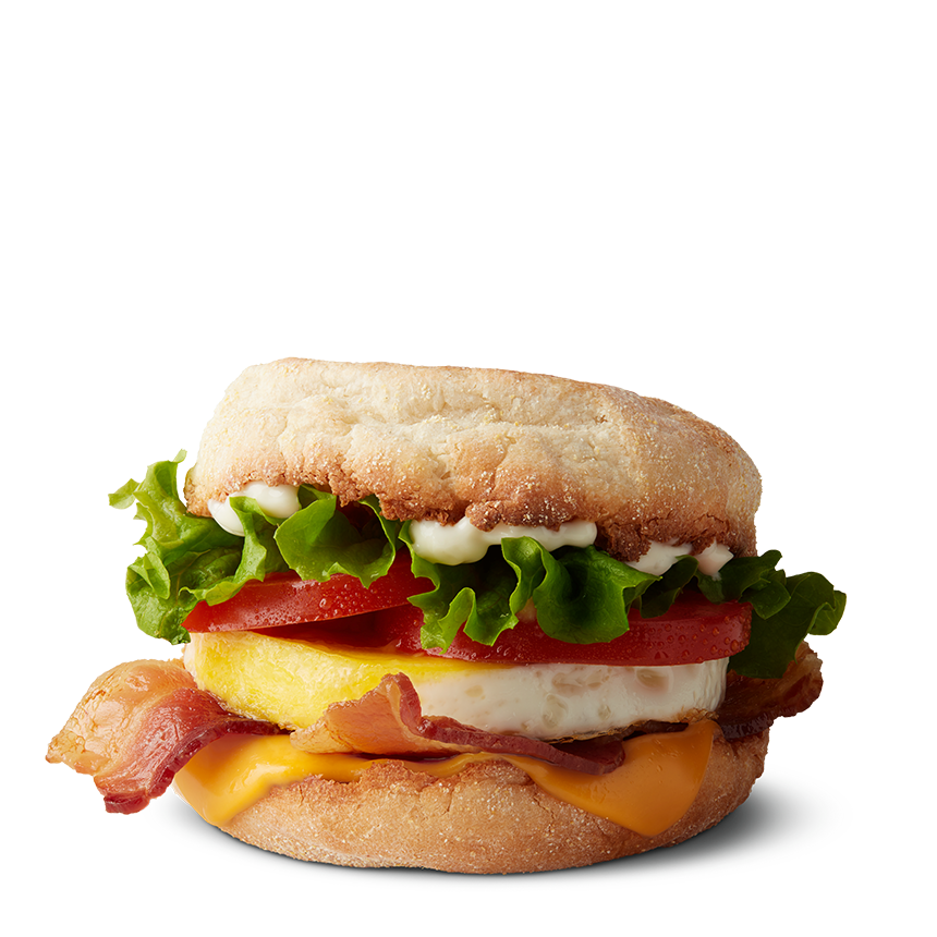
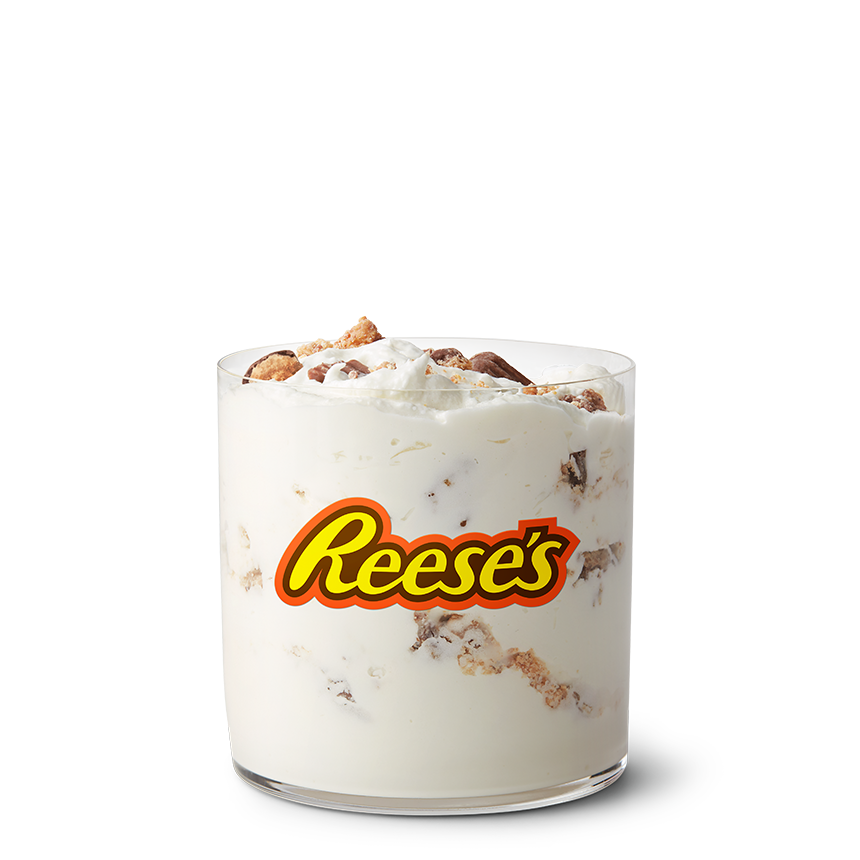
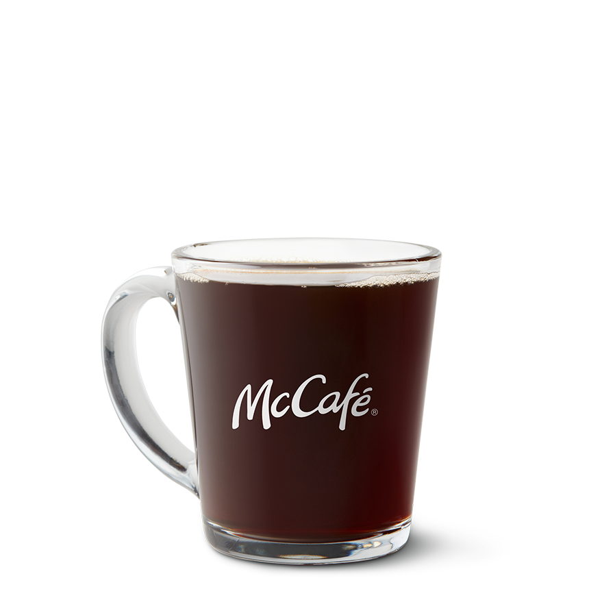
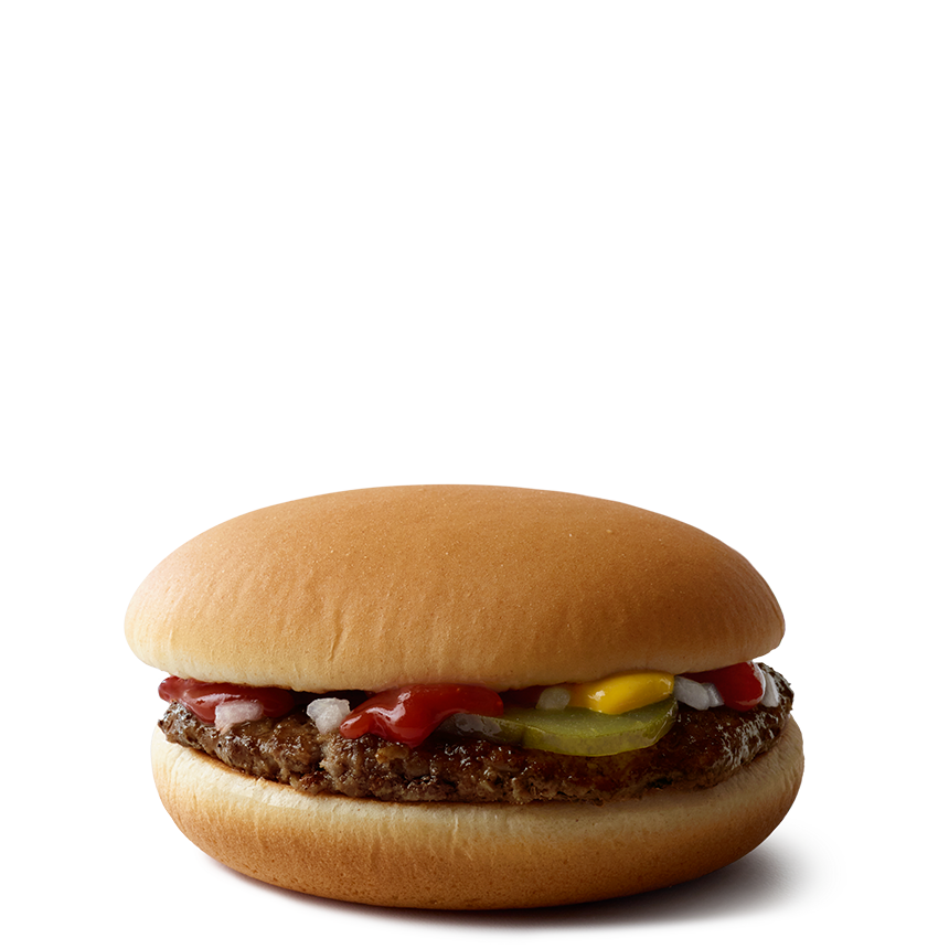
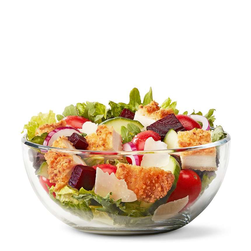
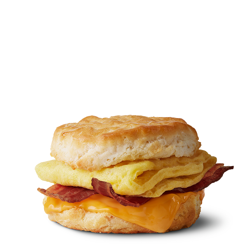
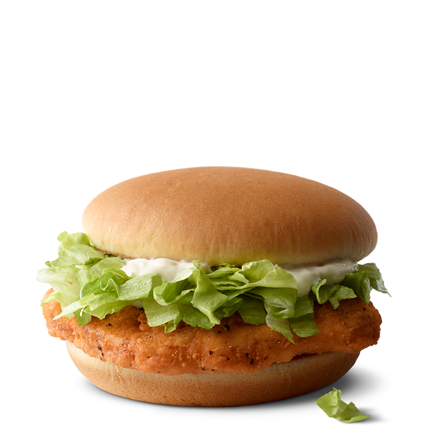
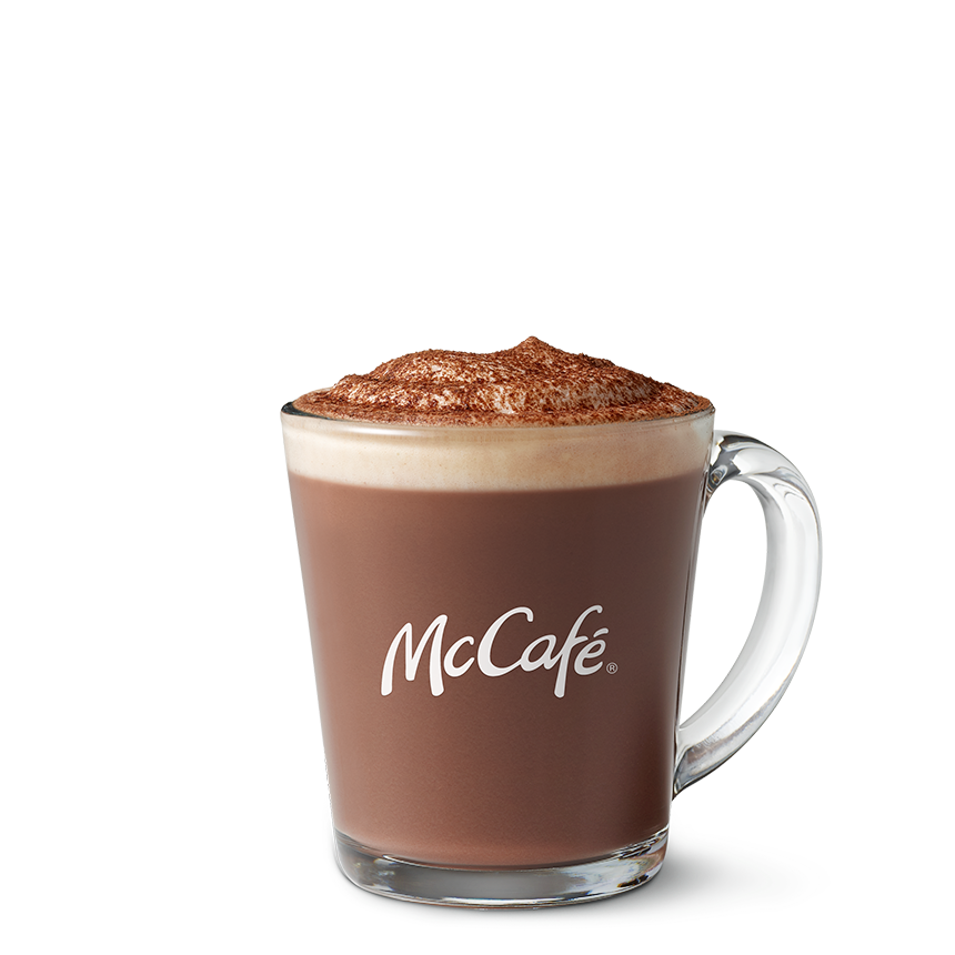
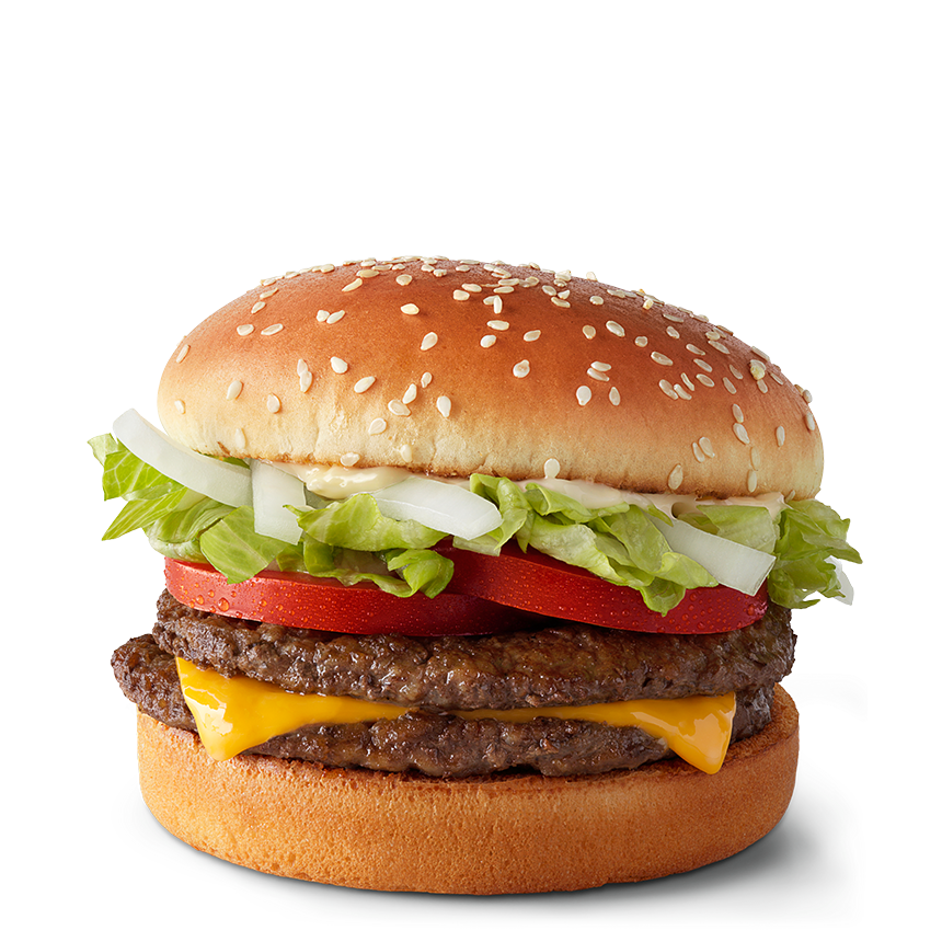
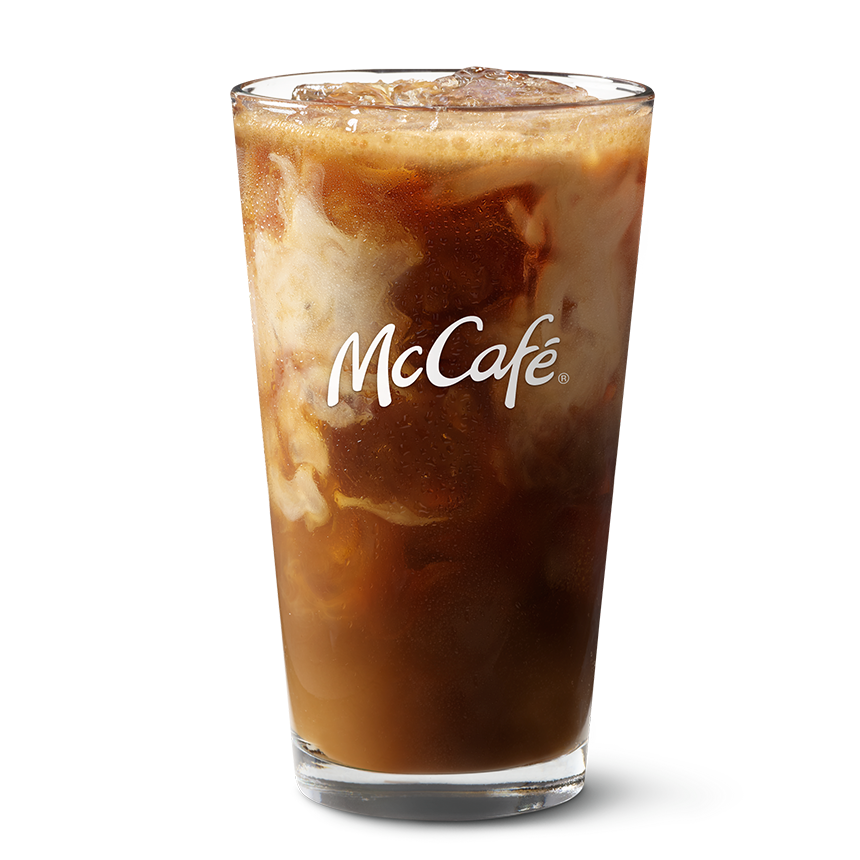
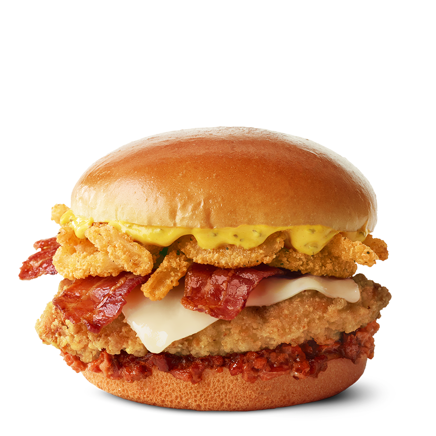
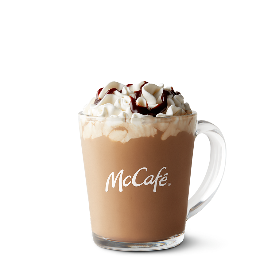
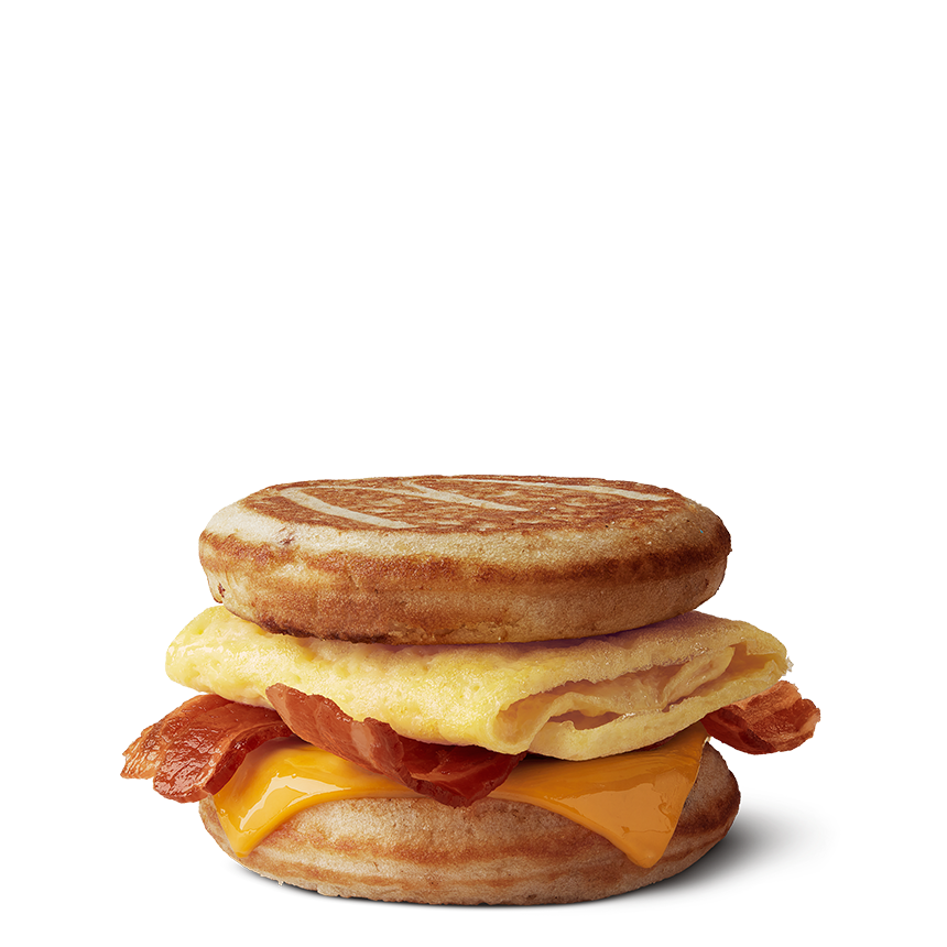
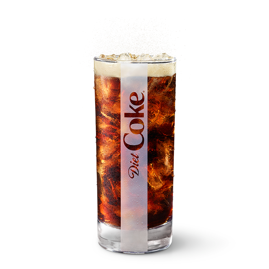
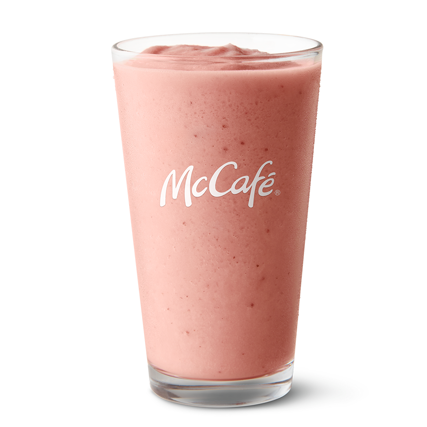
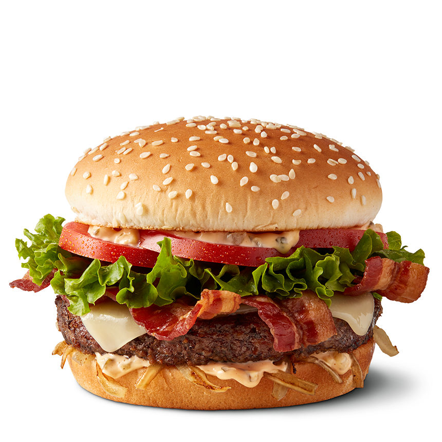
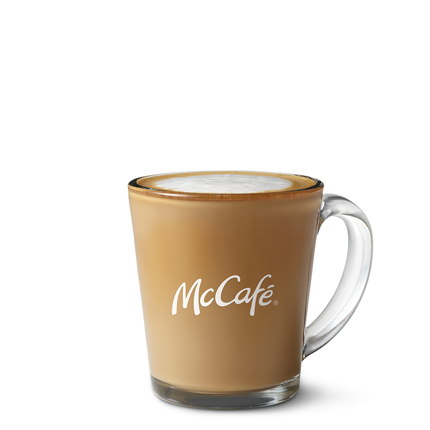
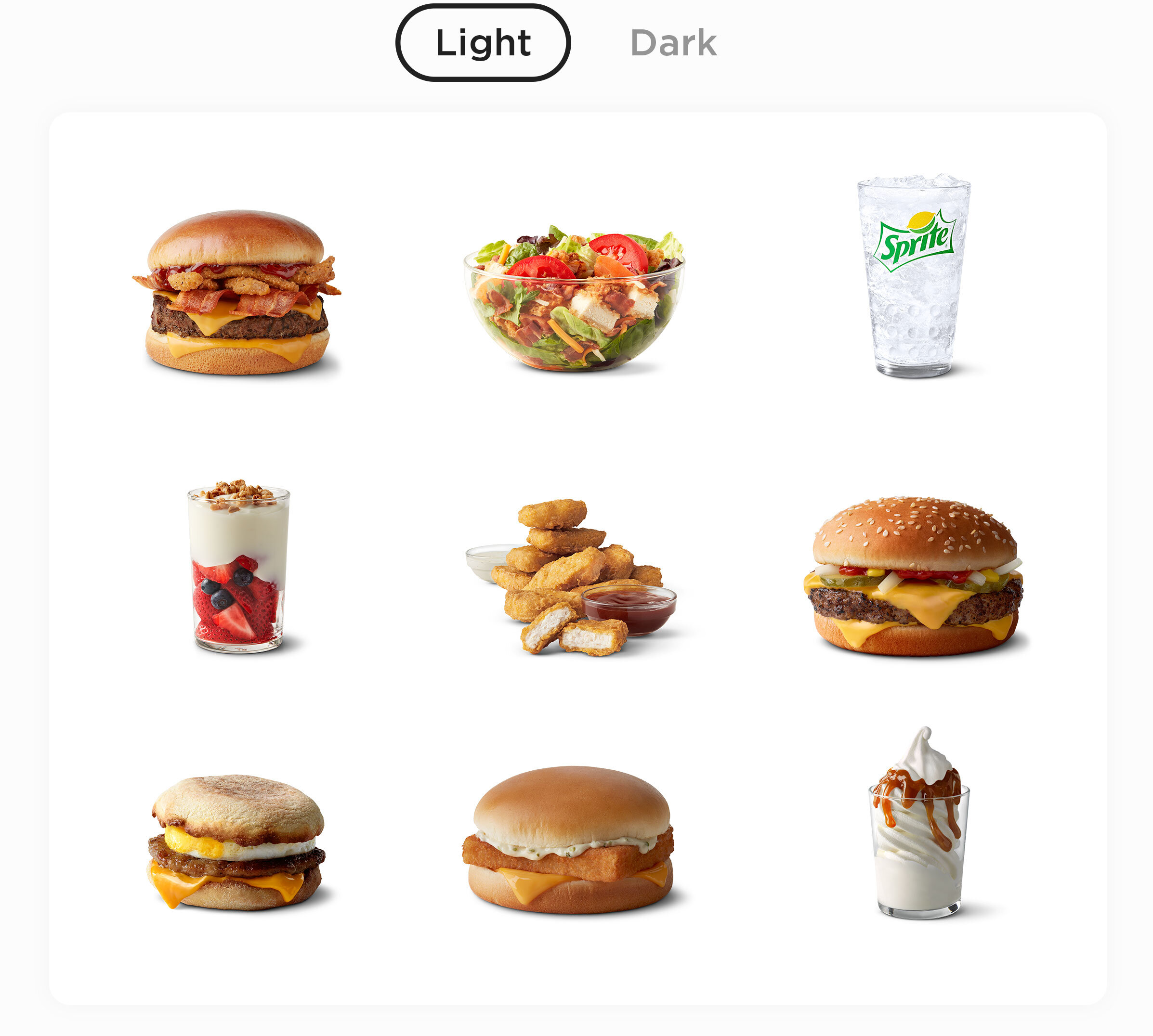
Coming up with a way to show over 200 menu items living across the McDonald’s mobile app, menu boards, and kiosk interface can be extremely chaotic. That’s why we developed a consistent look and feel for every image that included more natural imperfections, more contrast, better highlights, and consistent shadows to make everything work together seamlessly.
See the difference.
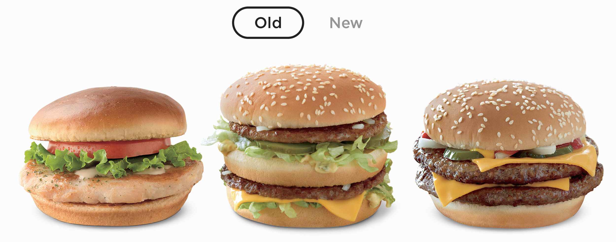
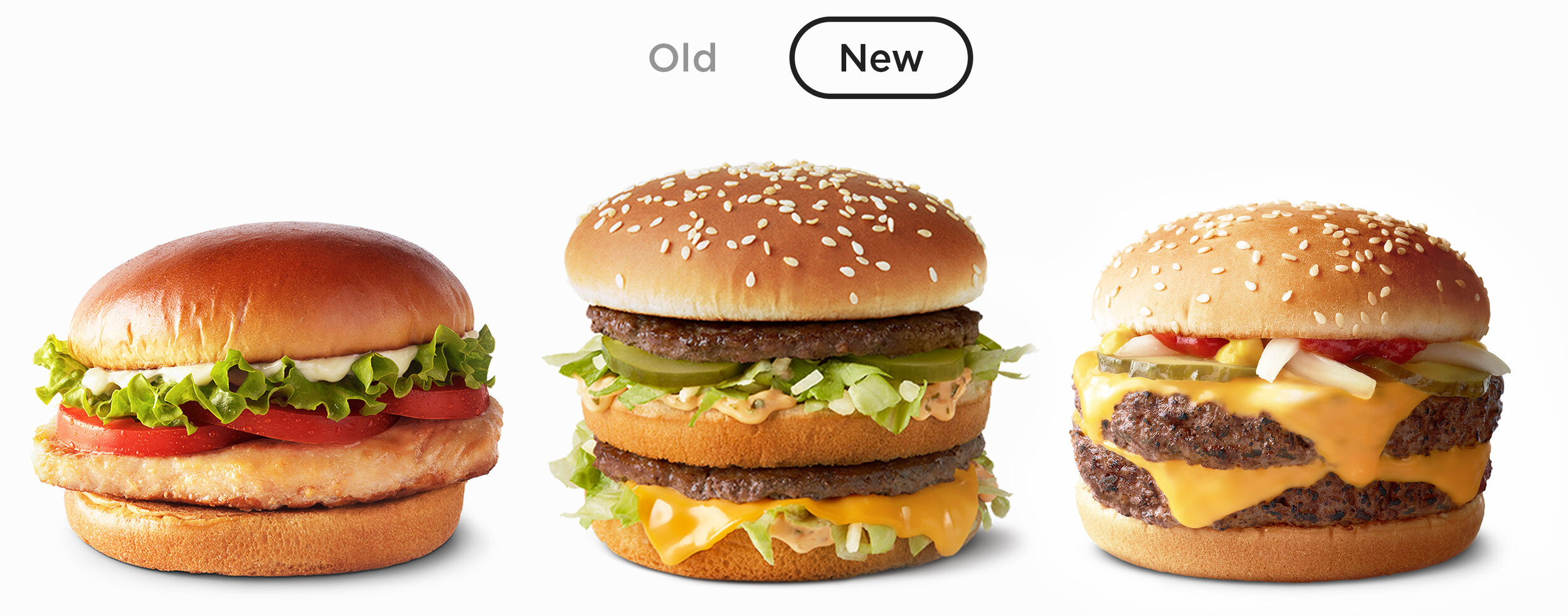
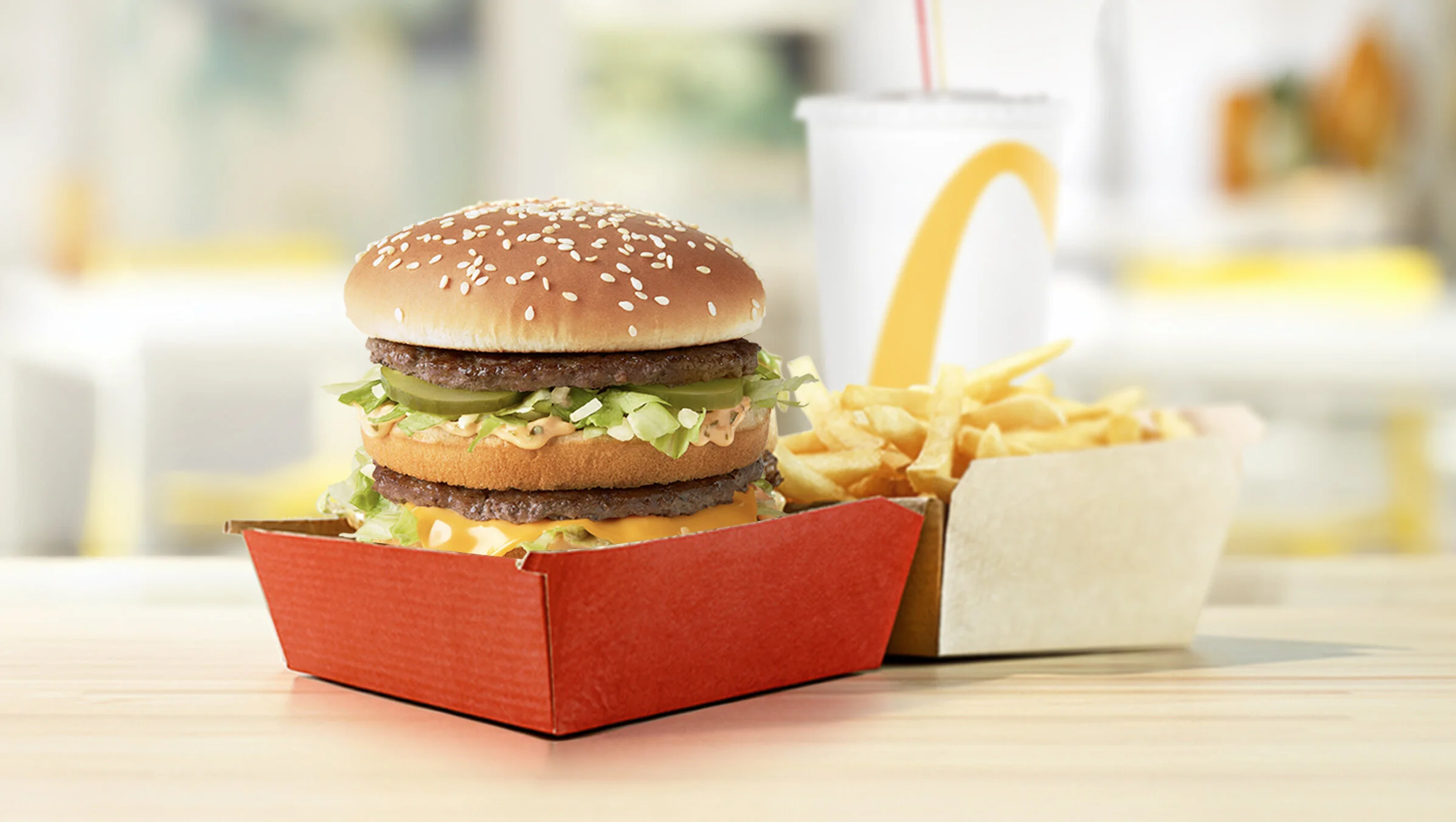
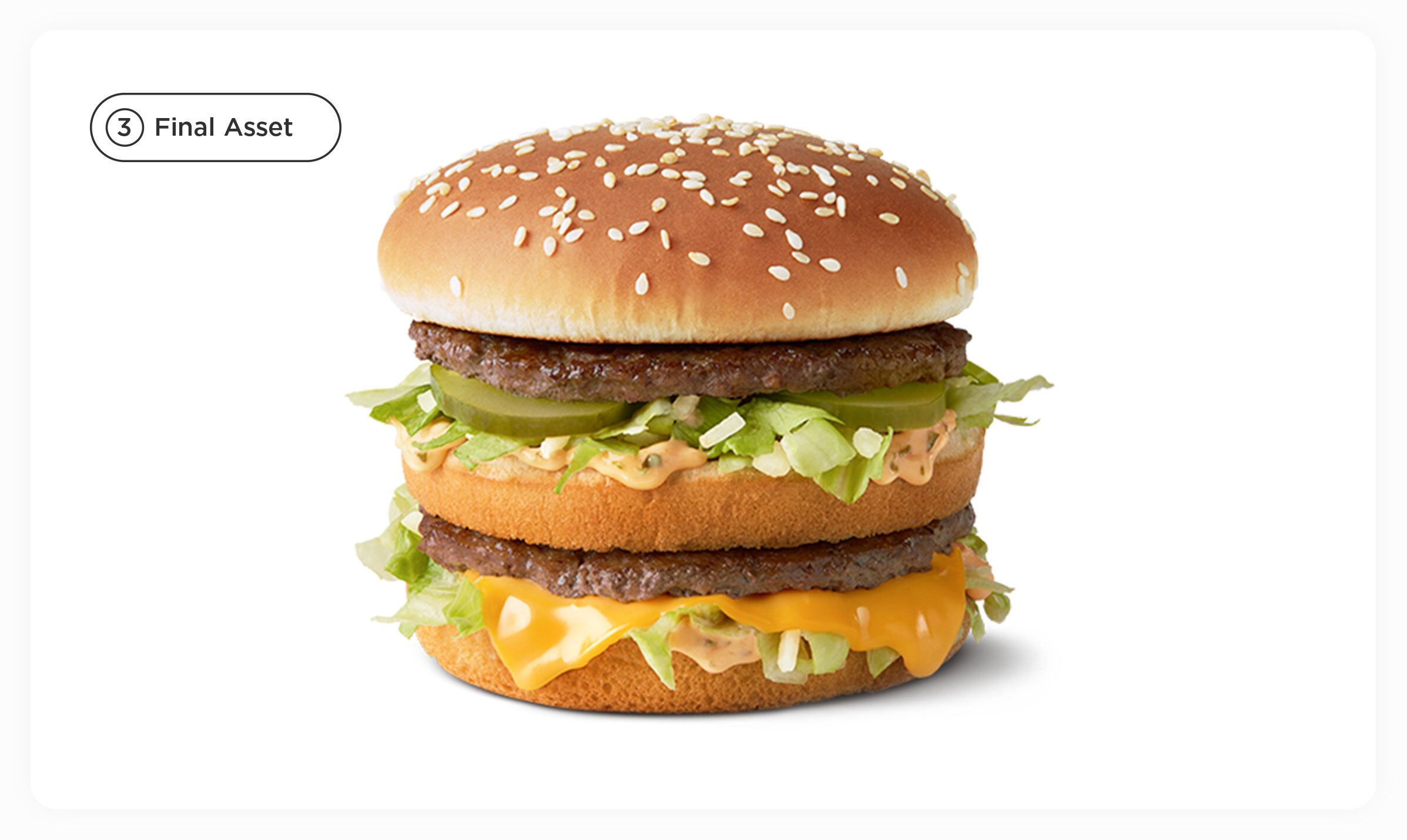
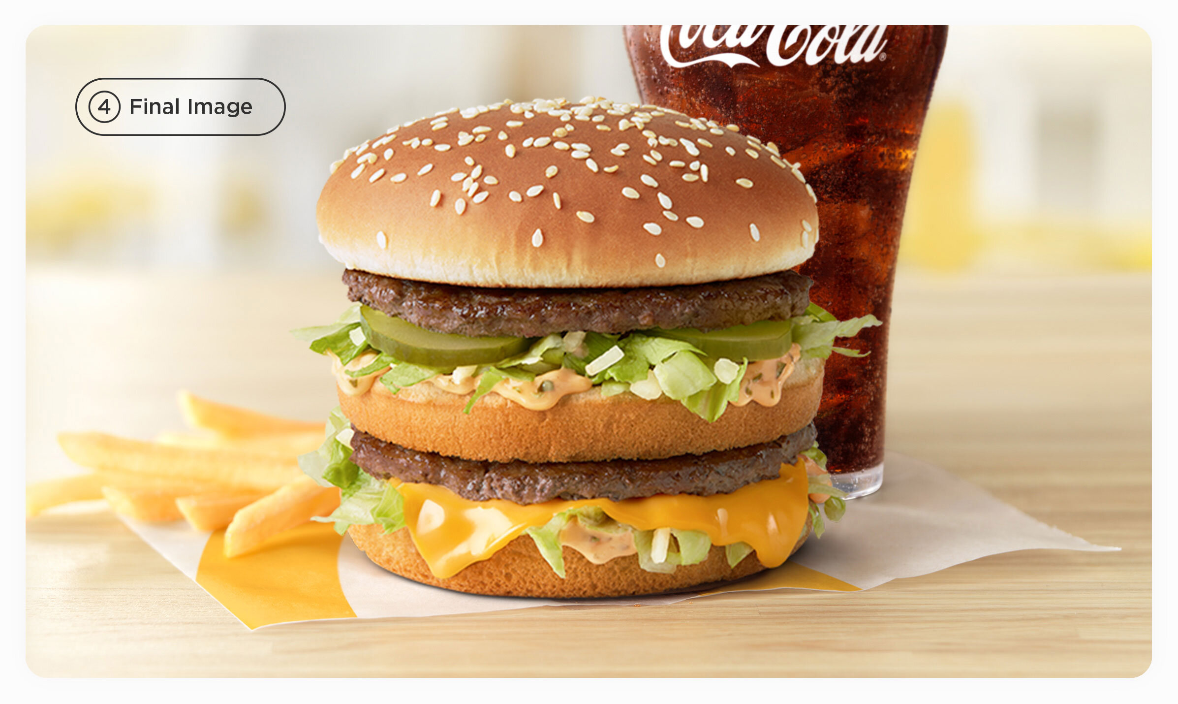
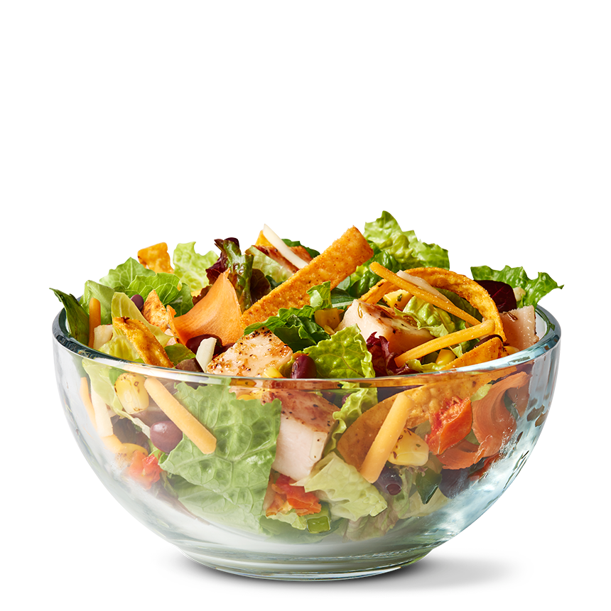
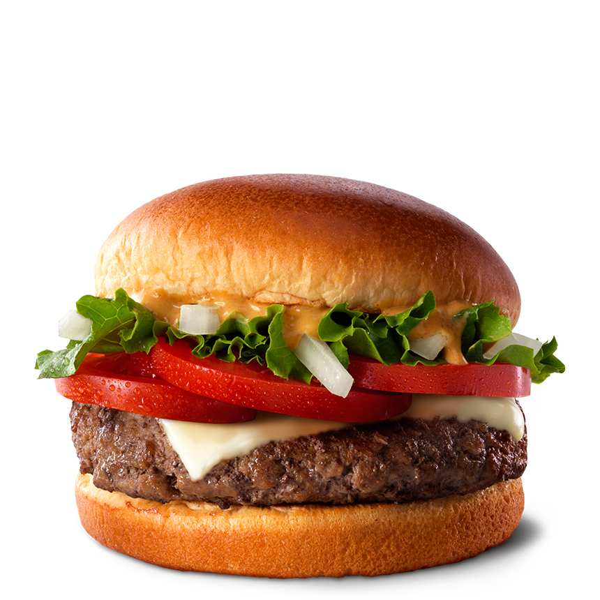
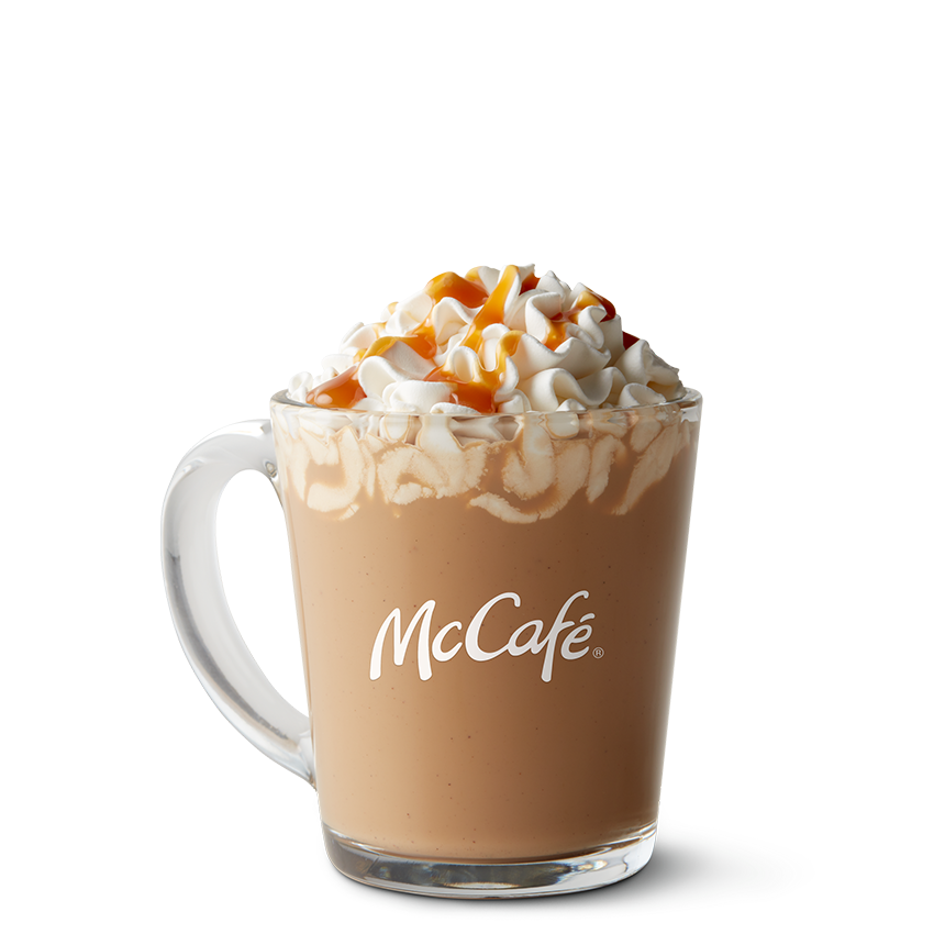
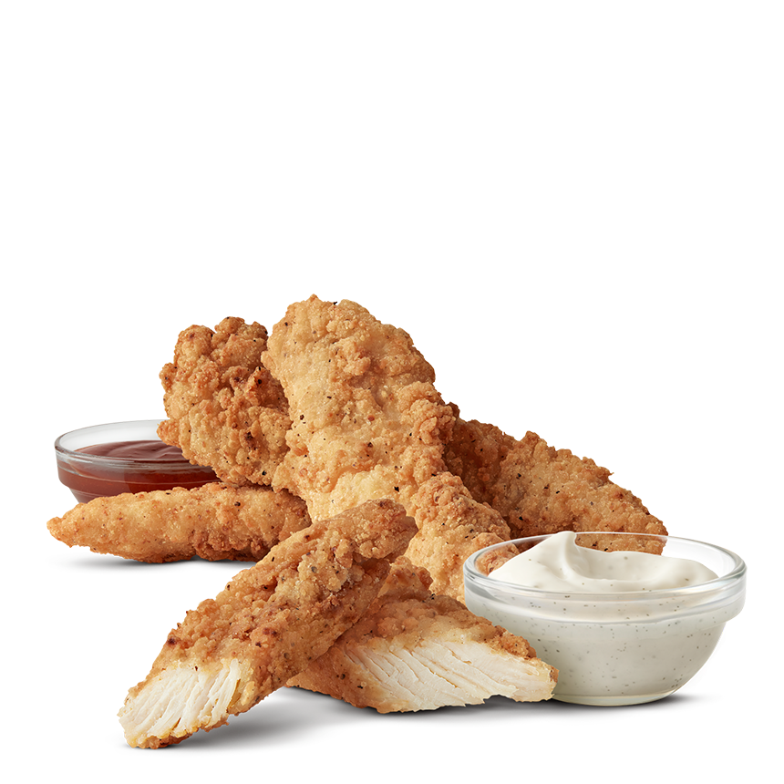
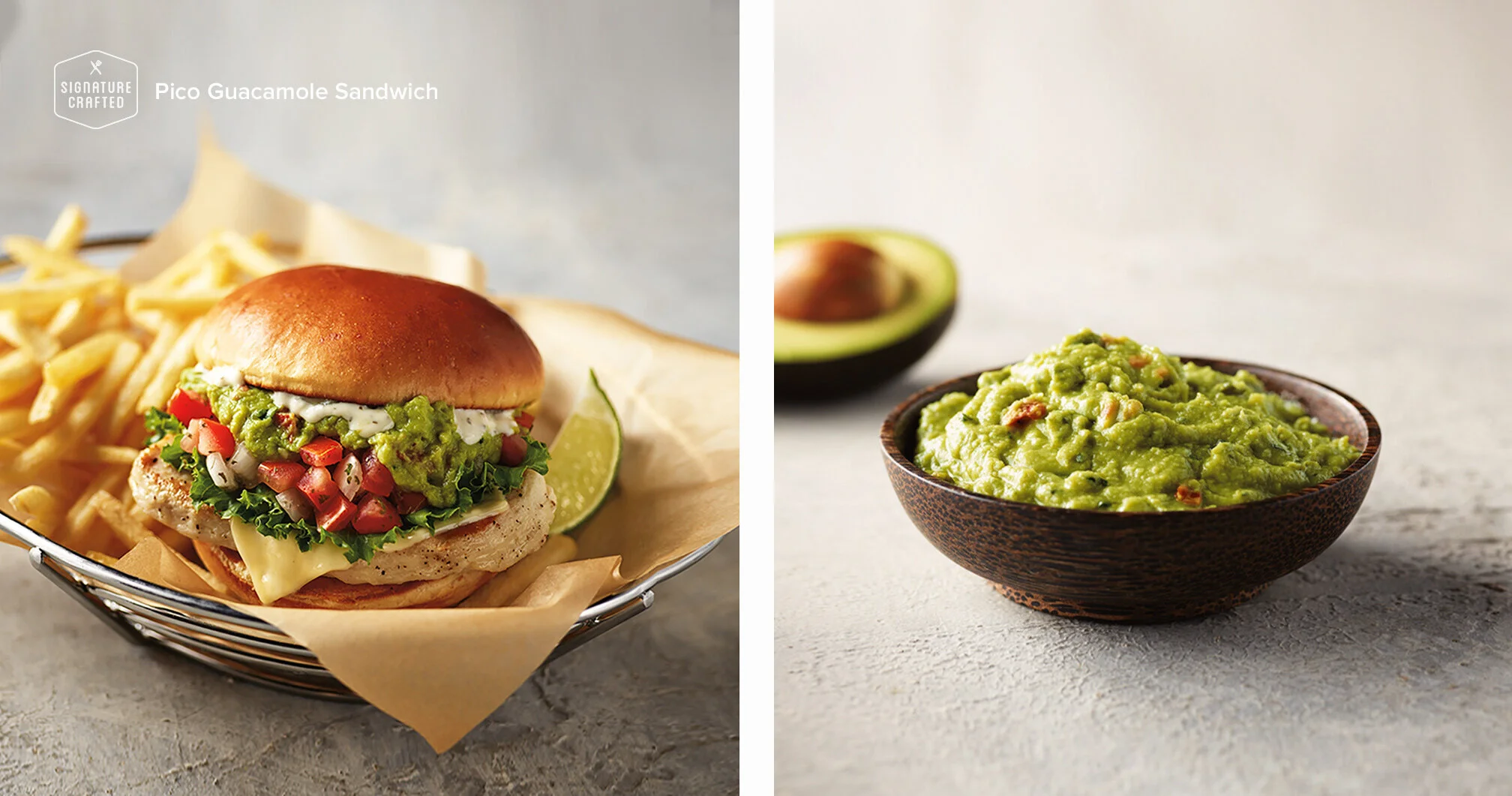
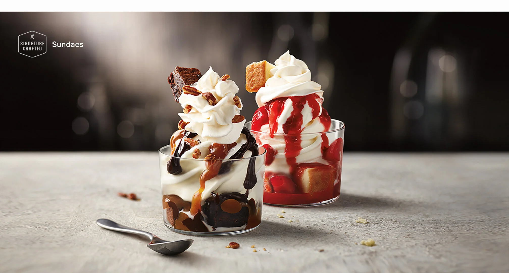
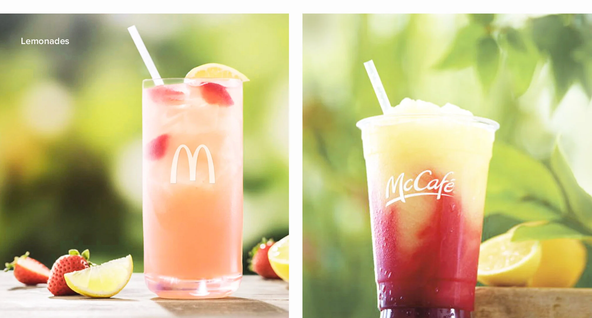
Here is a sampling of food images I helped art direct while working with the McDonald's team. This new look is a complete departure from the polished, overly perfect, almost plastic looking food images that consumers were familiar with on the McDonald's menu. These images are used across the McDonald’s mobile app, menus, and website.
A fresh new process.
Check them out for yourself.
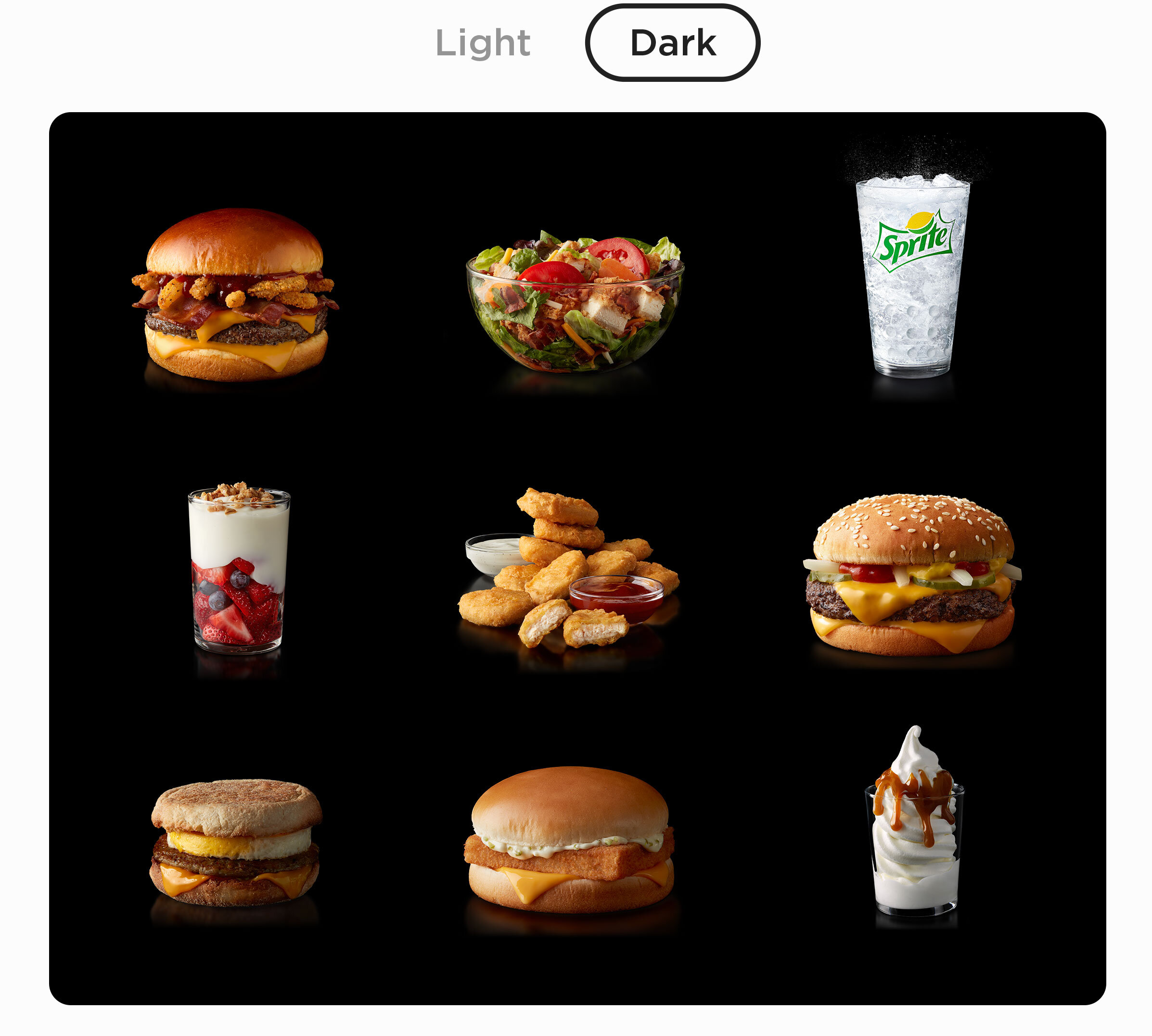
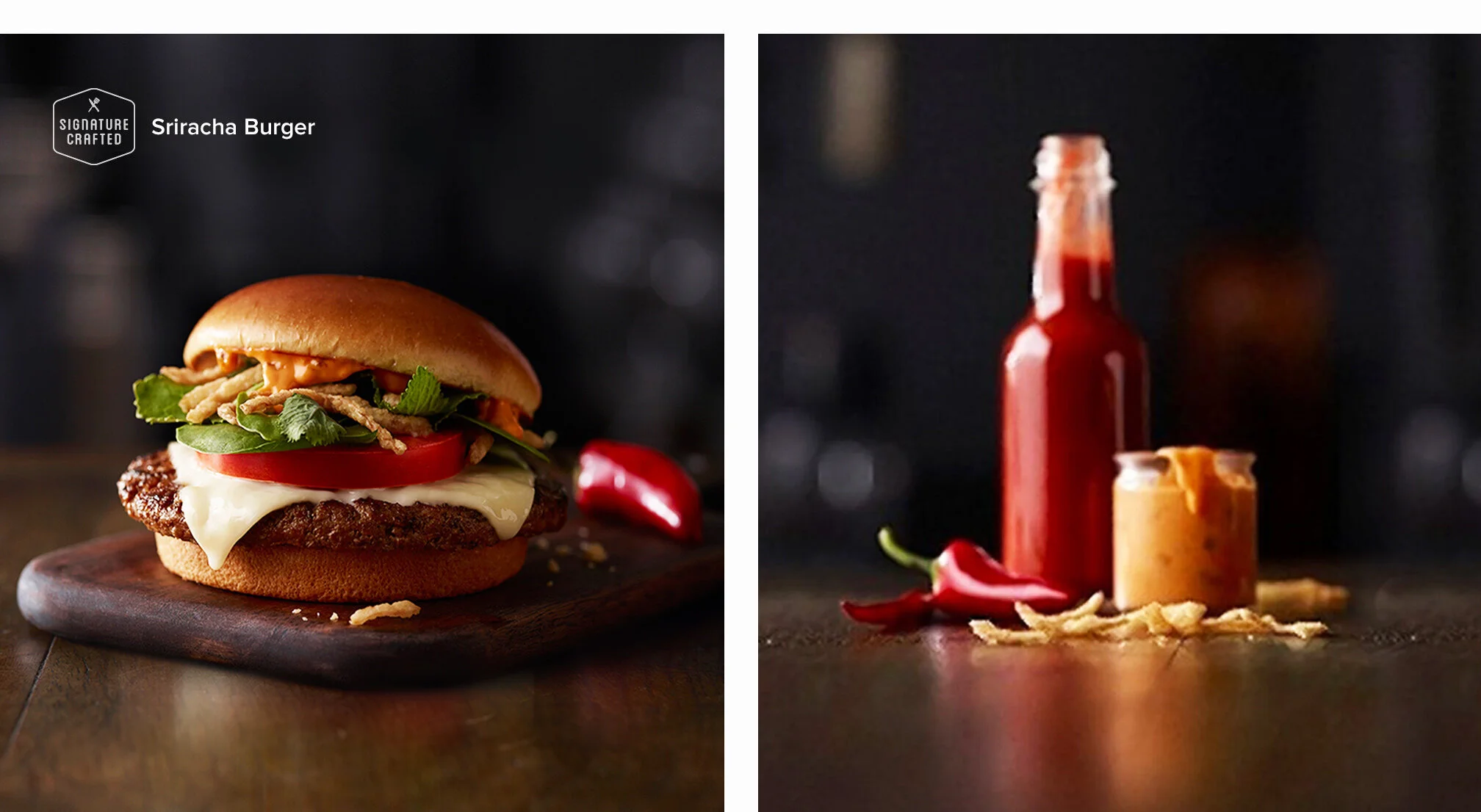
Each McDonald’s item was also shot on dark.
We also developed a system for shooting each McDonald’s item for dark situations using more contrast, depth, and reflections.
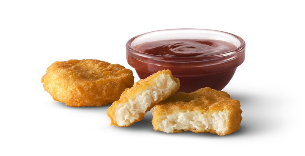
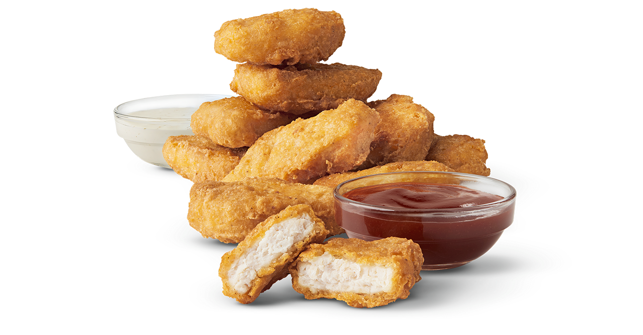
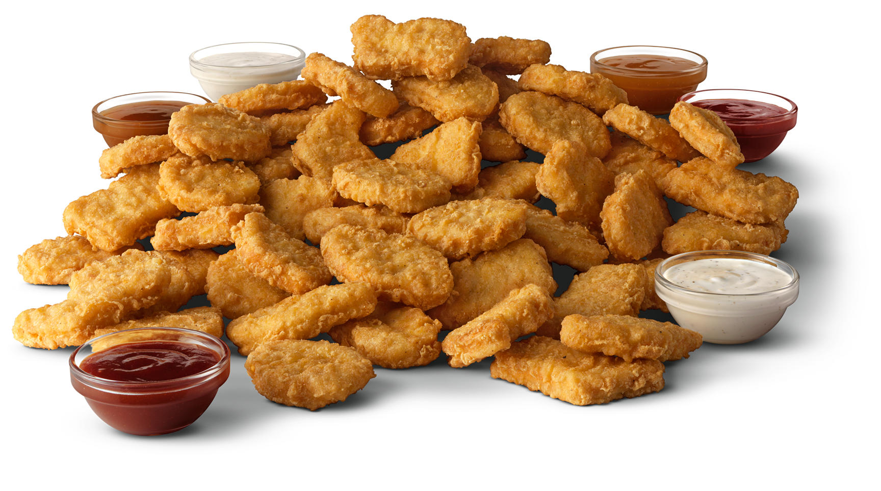
We really did shoot EVERYTHING.
From just 2 McNuggets…
🙂
…to 10 McNuggets…
😀
…even 50 McNuggets.
😳
![LOGO [Recovered]-06.png](https://images.squarespace-cdn.com/content/v1/5db5cda062d0152e8e43137b/1572310583032-56H17QBD4NB3TFU9O2YJ/LOGO+%5BRecovered%5D-06.png)
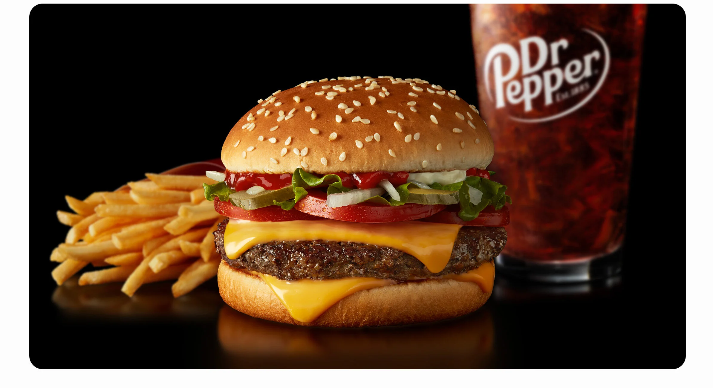
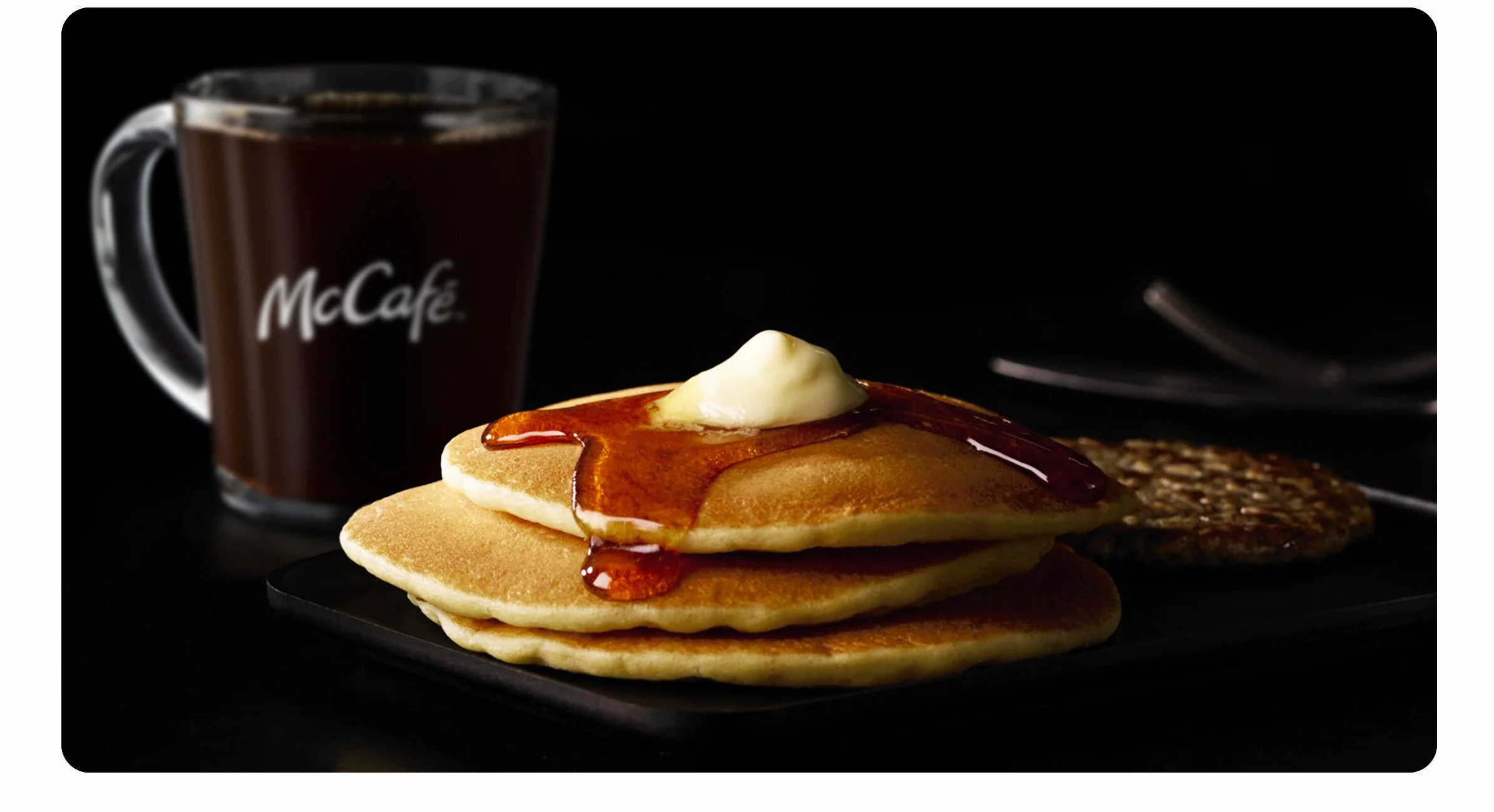
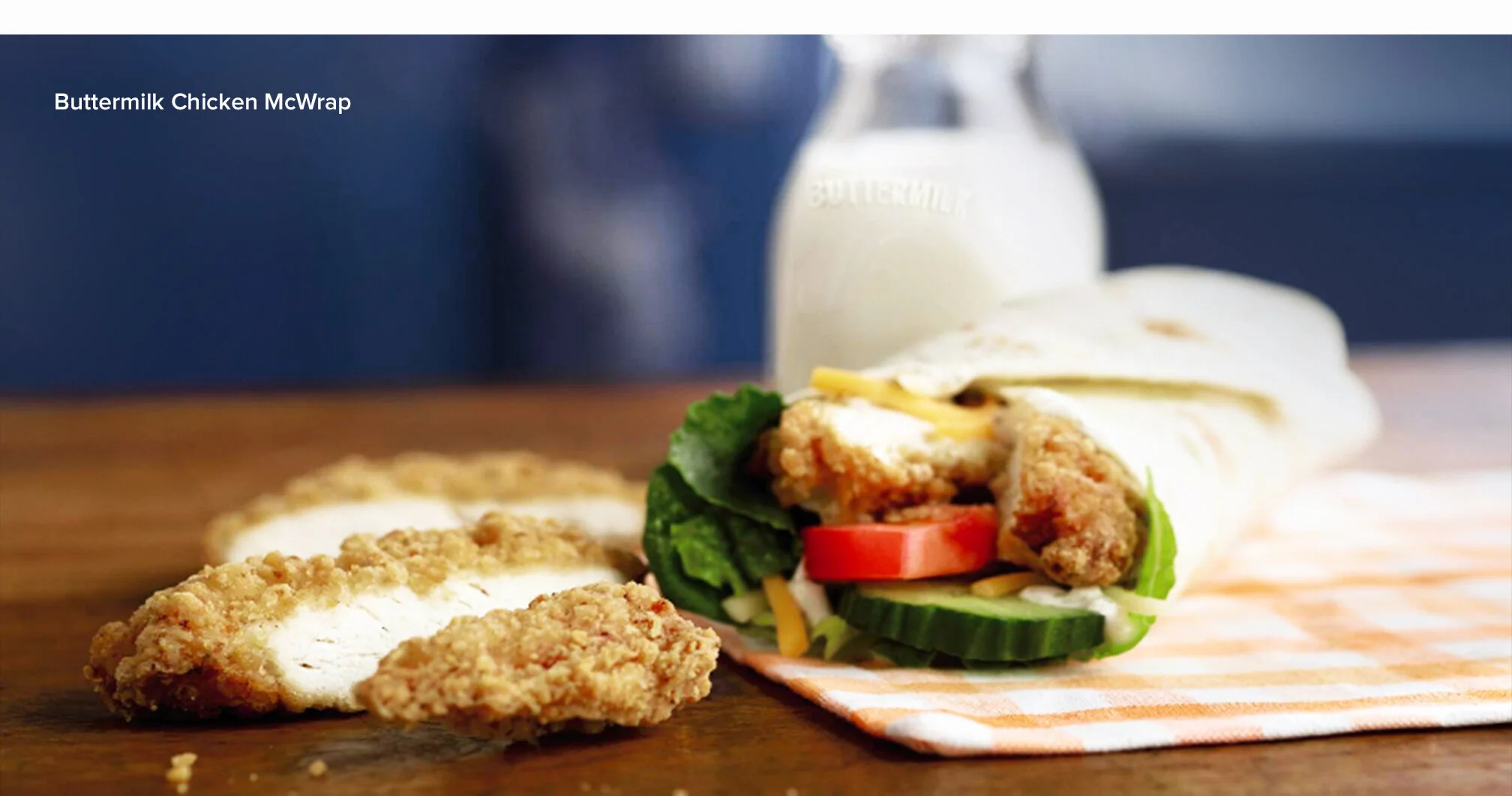
Food Photography
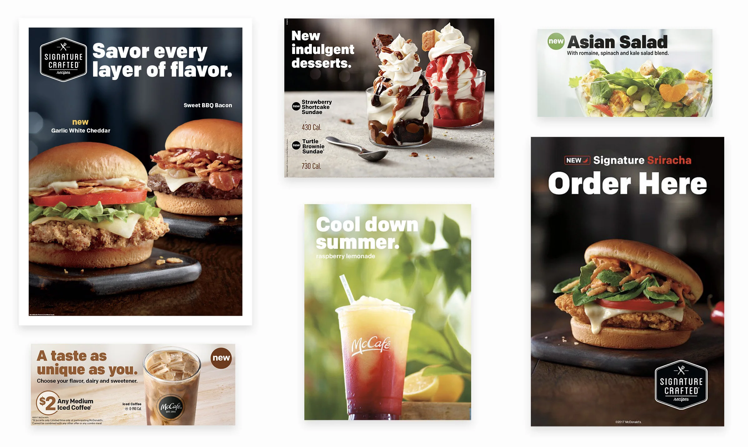
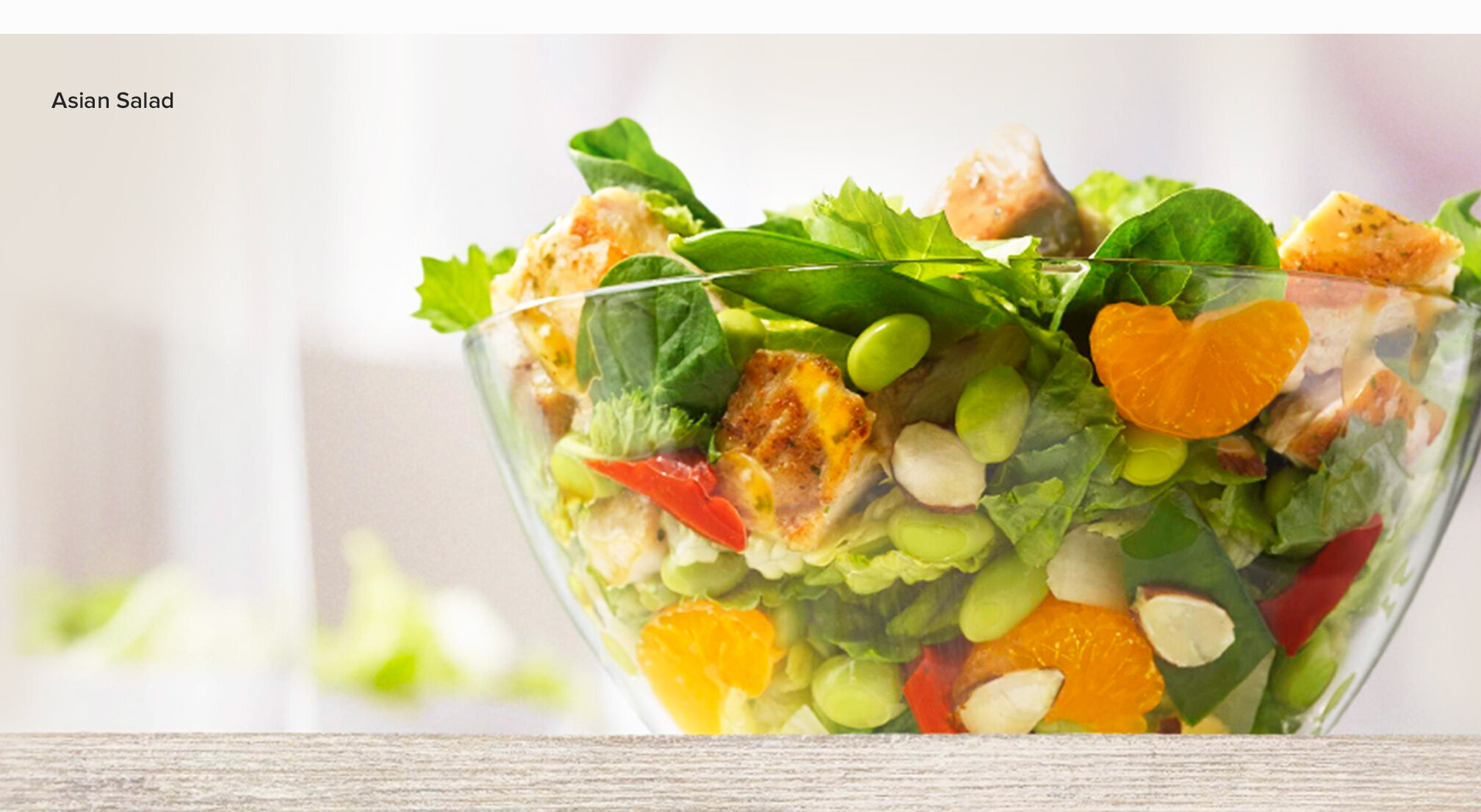
With four years working with the McDonald’s team, I’ve had the opportunity to work on some great food campaigns that have incorporated some beautiful photography. Here’s a few of my favorites.
![LOGO [Recovered]-23.png](https://images.squarespace-cdn.com/content/v1/5db5cda062d0152e8e43137b/1572310620951-1RJ88B59V0S1SI8JRKO3/LOGO+%5BRecovered%5D-23.png)